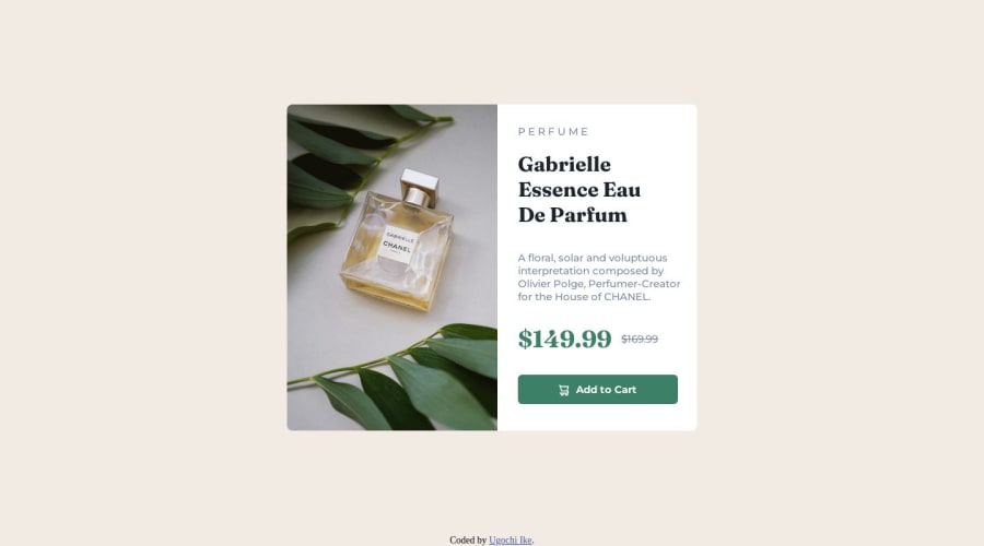
Not Found
Not Found
Not Found
Not Found
Not Found
Not Found
Not Found
Not Found
Not Found
Not Found
Not Found
Not Found
Not Found
Not Found
Not Found
Not Found
Not Found
Not Found
Not Found
Not Found

Submitted

Responsive product preview card component

Ugochi Ike 180

@noneofurbuzz

Desktop design screenshot for the Product preview card component coding challenge

This is a solution for...

  • HTML
  • CSS
1newbie
View challenge

Design comparison


SolutionDesign

Solution retrospective


I actually started with the desktop view first and then when I got to the mobile view I was lost so I had to start all over again. Working with responsive designs was hard but I think the more I do it the more I get used to it.

Community feedback

@0xabdulkhaliq

Posted

Hello there 👋. Congratulations on successfully completing the challenge! 🎉

  • I have other recommendations regarding your code that I believe will be of great interest to you.

HTML 🏷️:

  • This solution may cause accessibility errors due to lack of semantic markup, which causes lacking of landmark for a webpage and allows accessibility issues to screen readers, due to accessibility errors our website may not reach its intended audience, face legal consequences, and have poor search engine rankings, highlighting the importance of ensuring accessibility and avoiding errors.
  • What is meant by landmark ?, They used to define major sections of your page instead of relying on generic elements like <div> or <span>. They are use to provide a more precise detail of the structure of our webpage to the browser or screen readers
  • For example:
    • The <main> element should include all content directly related to the page's main idea, so there should only be one per page
    • The <footer> typically contains information about the author of the section, copyright data or links to related documents.
  • So resolve the issue by replacing the <div class="container"> element with the proper semantic element <main> in your index.html file to improve accessibility and organization of your page

.

I hope you find this helpful 😄 Above all, the solution you submitted is great !

Happy coding!

Marked as helpful

0

@matheuzeba

Posted

One thing that helped me with responsive design was always start by building the mobile design first, then using media-query to make it responsive on the desktop.

I think this reddit thread is a good read if you want to learn more about the topic:

https://old.reddit.com/r/webdev/comments/ly8qwh/is_it_really_worth_to_do_mobile_first

Marked as helpful

0

Ugochi Ike 180

@noneofurbuzz

Posted

@matheuzeba thankyou!

1

Please log in to post a comment

Log in with GitHub
Discord logo

Join our Discord community

Join thousands of Frontend Mentor community members taking the challenges, sharing resources, helping each other, and chatting about all things front-end!

Join our Discord