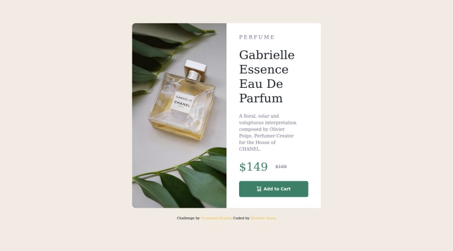
Design comparison
Solution retrospective
Hardest part for me was finding examples to learn mobile 1st media queries.. and naming my css variables. However, I learned so much for my 1st public project that I did on my own.
Community feedback
- @elaineleungPosted over 2 years ago
Hey Heather, great job completing your first challenge! There are a few things you can do to make your component look more like the design, and I can also see that there are some issues that's causing certain things to not show up. Here are things you can fix:
- Unnecessary words in custom variables:
In your CSS, I can see that the
:root
has some custom variables that are faulty, namely the font families:--font-montserrat: font-family: 'Montserrat', sans-serif;
You'll need to remove the
font-family:
bit first before you can use these variables- Missing font family property in CSS rules:
You'll also need to actually add/use the
font-family:
property in the appropriate selectors. I see that you usedfont
instead (e.g.,font: var(--font-montserrat);
), and that would have worked if you also specified a font-size value becausefont
is a shorthand property, and it must have thefont-family
andfont-size
values for it to function. Since the font size usually changes (depending on responsive design), most people opt to split up the properties instead of using the shorthand. In any case, you can experiment and see what happens if you add a font size value next to your font family variable. For the long haul, my suggestion is to stick withfont-family
.-
Image height a bit short in desktop view: In your media query, try using
unset
instead of350px
as a value -
Long form overwritten by short form for image corners: Just to follow Fatlind's advice from above about corners, you'd also want to change the property of the border radius for your image. I can see in your code that you're using the long form in the your
.card
selector, but in the desktop media query, you're using theborder-radius
short form instead. That could be a reason why the short form continues showing up. In your.card
selector, try replacing the both border properties with the short form ofborder-radius: 10px 0 0 10px
. The short form starts from the top left corner and then goes clockwise.
That should be enough for now; good luck and welcome to Frontend Mentor!
Marked as helpful0 - @mubizzyPosted over 2 years ago
Excellent job on this challenge! your report has a few issues though:
- wrap everything in your body in
<main>
or use semantics
2. it is a best practice to use both HTML 5 and ARIA landmarks to ensure all content is contained within a navigational region.
Hope it helps:)...don't forget to mark it as helpful 👍
You can get more details here...click here
Marked as helpful0 - wrap everything in your body in
- @fatlindshehuPosted over 2 years ago
Hi there, Congrats on your 1st project, you did good, I would recommend some stuff to make it even better:
- Check the
fonts
they seem pretty different from the original ( check them on the files provided by FEM) - Give
.card { border-radius: 10px; overflow: hidden; }
to make rounded corners in desktop & mobile.
Nice way using flex to center the component, thumbs up :)
Keep up the good work...
Marked as helpful0@CodingwithHeatherPosted over 2 years ago@fatlindshehu Thank you for the feedback.. Yeah, I think my variables did not work correctly. I took the fonts from the Figma File download, I am going to see how to fix that.. and I will also add the .card { border-radius: 10px; overflow: hidden; } as well. Thank you!
1 - Check the
Please log in to post a comment
Log in with GitHubJoin our Discord community
Join thousands of Frontend Mentor community members taking the challenges, sharing resources, helping each other, and chatting about all things front-end!
Join our Discord