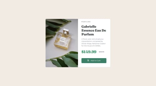
Submitted over 1 year agoA solution to the Product preview card component challenge
Responsive Product Preview Card Challenge
bootstrap

@Juliancito1
Solution retrospective
What are you most proud of, and what would you do differently next time?
I think i'm proud of using Bootstrap makes a lot easier and less coding on CSS.
What challenges did you encounter, and how did you overcome them?No mayor challenges
What specific areas of your project would you like help with?I had to limit the max height of the card on medium and large devices to be align with the card img, so i think if I knew another way to do it I will change it
Code
Loading...
Please log in to post a comment
Log in with GitHubCommunity feedback
No feedback yet. Be the first to give feedback on Julian Martin's solution.
Join our Discord community
Join thousands of Frontend Mentor community members taking the challenges, sharing resources, helping each other, and chatting about all things front-end!
Join our Discord