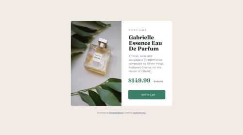
Submitted over 1 year agoA solution to the Product preview card component challenge
Responsive Product Preview Card

@jvisme1991
Solution retrospective
What are you most proud of, and what would you do differently next time?
I am most proud of the responsiveness and getting the images to swap smoothly.
What challenges did you encounter, and how did you overcome them?I had some struggles with the design adjusting to a larger screen size but I was able to overcome the issues by going back through and slowing down.
What specific areas of your project would you like help with?none at the moment
Code
Loading...
Please log in to post a comment
Log in with GitHubCommunity feedback
No feedback yet. Be the first to give feedback on Jarrod Ver Hey's solution.
Join our Discord community
Join thousands of Frontend Mentor community members taking the challenges, sharing resources, helping each other, and chatting about all things front-end!
Join our Discord