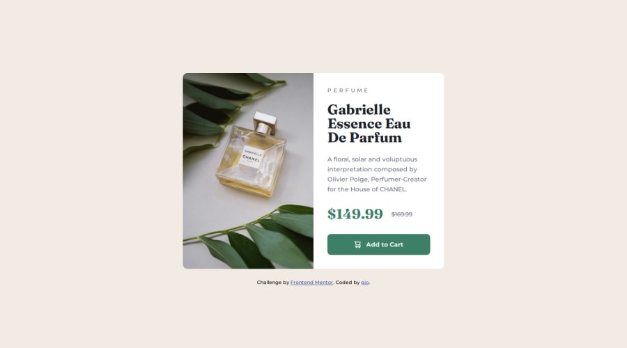
Design comparison
SolutionDesign
Solution retrospective
What are you most proud of, and what would you do differently next time?
I am most proud of getting the finished product to be almost 100% pixel perfect. What I would do different next time is to pay closer attention to the default text styles (line height, font-weight, font-family), because that would've saved me a lot of time.
What challenges did you encounter, and how did you overcome them?The figma file did not contain any spacing information, so I had to ensure I made the right spacing decisions by using the pixel perfect chrome extension, as well as just calculating the remaining space using element heights.
What specific areas of your project would you like help with?Semantics and class reusability
Community feedback
Please log in to post a comment
Log in with GitHubJoin our Discord community
Join thousands of Frontend Mentor community members taking the challenges, sharing resources, helping each other, and chatting about all things front-end!
Join our Discord
