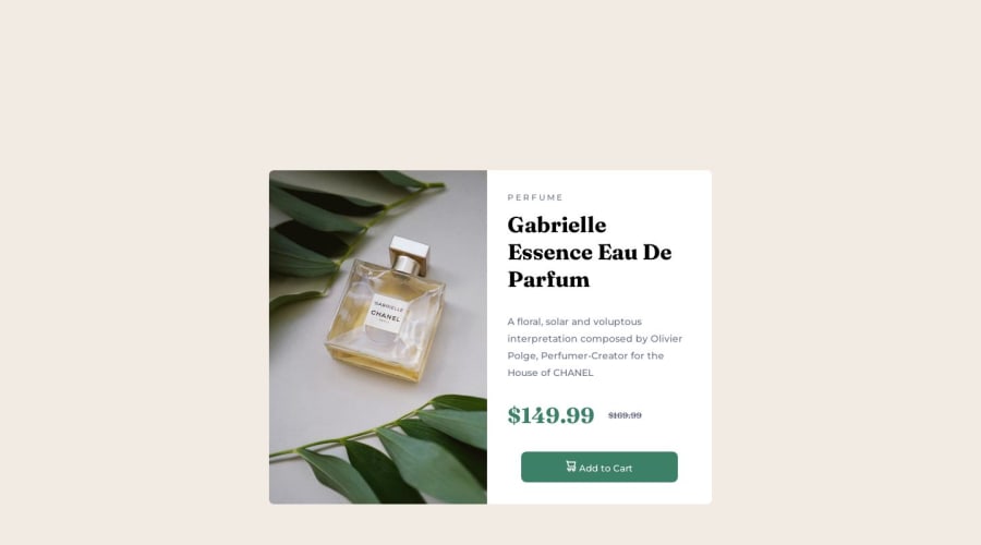


Design comparison

Solution retrospective
Starting out with front end developing with this as my first project.
Initially writing of the media query was tricky, wonder if following the style guide is the best idea as the max/min widths could have been a bigger size.
Open to any suggestions
Community feedback
- @0xabdulkhaliqPosted over 1 year ago
Hello there 👋. Congratulations on successfully completing the challenge! 🎉
- I have other recommendations regarding your code that I believe will be of great interest to you.
PiCTURE TAG 📸:
- Looks like you're currently using single image for both Desktop & Mobile devices, but we want to swap images according to their screen sizes. Luckily there's a native html element which may help us to achieve this method without need of css
- So let me introduce the
pictureelement.
- The
<picture>tag is commonly used for responsive images, where different image sources are provided for different screen sizes and devices, and for art direction, where different images are used for different contexts or layouts.
- Example:
<picture>
<source media="(max-width: 768px)" srcset="small-image.jpg">
<source media="(min-width: 769px)" srcset="large-image.jpg">
<img src="fallback-image.jpg" alt="Example image">
</picture>
- In this example, the
<picture>tag contains three child elements: two<source>elements and an<img>element. The<source>elements specifies different image sources and the conditions under which they should be used.
- Using this approach allows you to provide different images for different screen sizes without relying on CSS, and it also helps to improve page load times by reducing the size of the images that are served to the user
- If you have any questions or need further clarification, you can always check out
my submissionand/or feel free to reach out to me.
.
I hope you find this helpful 😄 Above all, the solution you submitted is great !
Happy coding!
Marked as helpful2 - @ShamSutherPosted over 1 year ago
Hey there! Congratulations on embarking on your front-end development journey with your first project! ✨🎉
It's always exciting to dive into new challenges. Don't worry if writing the media query was a bit tricky at first – that's completely normal when you're getting started. Remember, practice makes perfect, and with time, you'll become more confident in handling such tasks.
Your solution looks wonderful! 😄 I happened to notice that you're using margins to center the card, which is a smart move. If you're open to suggestions, I'd like to share a syntax that could make centering even smoother. How about giving display flex and a height of 100vh a try?
body {
    background-color: hsl(30, 38%, 92%);
    height: 100vh;
    display: flex;
    justify-content: center;
    align-items: center;
}
I would like to suggest
for a better understanding of these topics.
Keep up the fantastic work, and remember, there's no rush. Enjoy the process, and before you know it, you'll be creating incredible front-end experiences.
Happy coding and best of luck with your projects! 🌟👩💻👨💻
Marked as helpful2 - @Maksym-PaselskyPosted over 1 year ago
Hi 👋
You can use flex on button to center the icon and text so they appear in one line.
display:flex;
align-items:center;
justify-content:center;
and add little margin to icon✨
button > img {
margin-right:20px;
}
Also, you can use more abstact css classes name for example change perfume to product. I know it's not a real project but treat it like it is📝.
Nice work! Keep it going! 👨💻
Marked as helpful0


Please log in to post a comment
Log in with GitHub
Join our Discord community
Join thousands of Frontend Mentor community members taking the challenges, sharing resources, helping each other, and chatting about all things front-end!
Join our Discord