Design comparison
SolutionDesign
Solution retrospective
What are you most proud of, and what would you do differently next time?
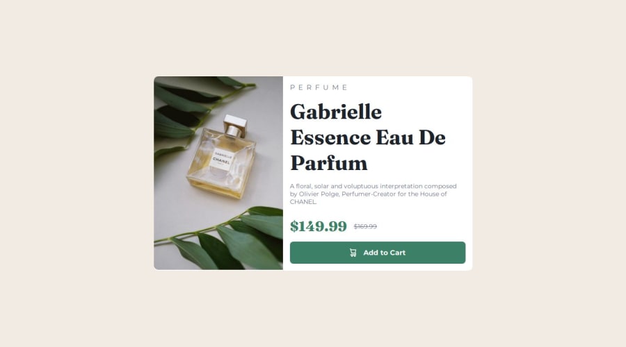
The final result looks pretty much the same as the provided one.
What challenges did you encounter, and how did you overcome them?To change the image as per the screen size. Needed to google it a little bit.
What specific areas of your project would you like help with?.
Please log in to post a comment
Log in with GitHubCommunity feedback
- @hebaahmedsaleh
Great job, I like the naming dor css colors. I think you need to make the content card sections are equal as each 50% of full width and the font sizes are bigger.
Marked as helpful
Join our Discord community
Join thousands of Frontend Mentor community members taking the challenges, sharing resources, helping each other, and chatting about all things front-end!
Join our Discord
