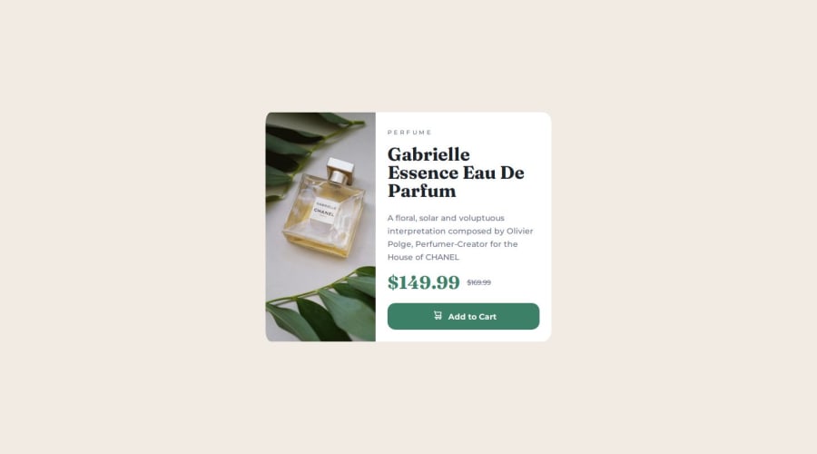
Design comparison
Solution retrospective
It's been 9 months since I last coded something and I am proud that I got into the swing of it again.
I am proud that it is responsive, I feel like I am getting better at a mobile first design. This was the first time I used em and rem as relative units instead if px's.
I did this project in a weird way, I wrote part of it in codepen then transferred to vscode, and i didn't look at the style guide until late. Next time I will start with the style guide and build up from there.
What challenges did you encounter, and how did you overcome them?I had no idea how to swap the images out between mobile and desktop. I had to do some google searches to figure that out with ID's. I haven't used images that much so I had to look up cover, contain etc and experimented with which one was correct.
What specific areas of your project would you like help with?I would like help with organisation - did I use too many div's, is the code easy to understand, is it professional? Does it look like a noob just threw it together LOL....I am trying to practice making sure it makes sense and is organised nicely.
Community feedback
- @ly-mathPosted about 1 month ago
Hi Kate, I'm happy that you're back into coding, I was just like you, almost quit coding twice in these 2 years. Now I'm learning React.js. This is the first time I'm back to this website, you are the first one I saw, I'm not an expert but here some tips from me:)
I've seen that you're struggling with responsive image, But you did good with display: none and display: block. But there is a better way with just 1 line html and no css involve:
<picture> <source media="(min-width:1440px)" srcset="desktop.jpg"> <img src="mobile.jpg" alt="..." > </picture>
You can just wrap your
img
withpicture
. as for the<source>
is where you put your min-width andsrcset
is where you put your image link. Your original image will replace by the source image once it hit your min-width.Another thing to consider is that you should always put header tags in order for example: h1 >> h2 >> h3 >> ... so on. in this case, I've seen you put in h2 before h1. this is not good practice for SEO (Search Engine Optimization).
You mention you've use alot of div, here's a list of what you can use in this situation for readability and SEO. Use
article
as a wrapper is also good practice as this card is also an article. Usesection
as a wrapper, i use this a lot when I have many section in my website. usemain
as wrapper, this should be your entire code wrapper except header and footer: e.g:<body> <header> <! --your header goes here.... --> </header> <main> <! -- everthing else here...... --> </main> <footer> <! -- your footer here..... --> </footer> </body>
In this case you have only one card in the entire website so you could use main as the wrapper.
hey, that's all from me Keep it up fellow developer.
Marked as helpful0@ClickClickKatePosted about 1 month ago@ly-math Thank you! Yeah sometimes I just think it's all too complex LOL, I also like to try to be too much of a perfectionist and what i've learnt is there are so many ways to do the same code. I just have to get used to that - that there isn't a 1 'right' answer. So i'm giving this coding malarky another go HA HA. I actually tried the picture tag but I only had an example with url's and couldn't get it to work with a local file, but I think i've figured it out since. I've never actually come across that before today. Thank you for the semantic html...I actually have this printed out...and i need to actually use it! I think before the next challenge I'll take a step back and make myself a really good workflow to use, including semantic html, setting variable etc. Thank you so much for your feedback. Keep it up too!!!
0 - @beowulf1958Posted about 1 month ago
Congratulations on completing this challenge. The html is clean, uncluttered, easy to read. CSS is organized. I love the way you commented the CSS.
A few suggestions. It doesn't render properly on my desktop--the desktop view doesn't come up, and it stays in mobile view (column-wise). You might want to adjust the media query to 780px so tablets get the desktop view.
Also, when you press the button, the page behaves strangely. The background-color of the body changes to --sec-darkblue, as does the background color of the contenttext, rendering the heading and button invisible! You might need to take a second look at your active state on the button. (There is also an extra curly brace at the bottom of the css file; it doesn't seem to match anything. This might have something to do with it.)
Try this:
.btn:hover, .btn:focus, .btn:active { background-color: var(--sec-darkblue); }
This worked for me. For extra fun, add the transition to .btn
transition: 0.5s ease-in-out;
Hope this helps.
0@ClickClickKatePosted about 1 month ago@beowulf1958 thank you! I do like my comments LOL, i find it helps me. I didn't notice the bug or the extra curly bracket, I will go back and fix! I think making the media query smaller would be a good idea too, I set it to that as the design for desktop was based on 1440px but I think in future I will do what I think is best rather than concentrate too much on that. Thanks so much for your feedback.
0 - @YacoubDweikPosted about 1 month ago
Hey Kate!
Good Job after 9 months and this is the result it is amazing!
I just wanna say that you can also use an element called picture and inside that you can put your images and set the media or the width let's say which you img 1 to be shown at it and the same applies for img 2, and there's a default case.
You can also do that using a property called content: url( ) as it can change the actual img for the element ing itself.
Another way is by setting a Div and change its backgroung-image according to the screen size.
I also suggest that you start using BEM name convention for classes (look it up it's easy).
And one last thing, do not use .btn:active cuz I believe this the reason for the bug that you have in your design, you will notice that when you click on the body background the color of it changes, so it is only :hover and not active or focus.
Keep it up!
0@ClickClickKatePosted about 1 month ago@YacoubDweik Thank you so much for the reply and the encouragement. I certainly took me a while to do but after 9 months I am ok with that. Ahhhh i didn't realise about the active...I need to go back and sort out the bug. I did come across that picture element but had a mind blank and couldn't get it to work. I think a tutorial mentioned the BEM convention...with the double underscore, i do like that look and will look into it! thank you
0
Please log in to post a comment
Log in with GitHubJoin our Discord community
Join thousands of Frontend Mentor community members taking the challenges, sharing resources, helping each other, and chatting about all things front-end!
Join our Discord