Not Found
Not Found
Not Found
Not Found
Not Found
Not Found
Not Found
Not Found
Not Found
Not Found
Not Found
Not Found
Not Found
Not Found
Not Found
Not Found
Not Found
Not Found
Not Found
Not Found

Submitted

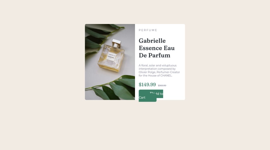
Responsive product preview card

#accessibility
uchethecreatorβ€’ 40

@uchethecreator

Desktop design screenshot for the Product preview card component coding challenge

This is a solution for...

  • HTML
  • CSS
1newbie
View challenge

Design comparison


SolutionDesign

Solution retrospective


What other ways can i get the mobile design image on top of the card container? This is my first ever responsive page, and i'm super proud. Please feel free to tell me ways i can improve this project.

Community feedback

@VCarames

Posted

Hey @uchethecreator, great job on this challenge!

Some suggestions to improve you code:

  • To center you content to your page, add the following to your Body Element:
body {
    min-height: 100vh;
    display: grid;
    place-content: center ;
}
  • The Alt Tag Description for the image needs to be improved upon. You want to describe what the image is; they need to be readable. Assume you’re describing the image to someone.

  • This challenges requires the use of two images πŸŽ‘ for different breakpoints. The Picture Element will facilitate this.

Here is an example of how it works: EXAMPLE

Syntax:

  <picture>
    <source media="(min-width: )" srcset="">
    <img src="" alt="">
  </picture>

More Info:

https://www.w3schools.com/html/html_images_picture.asp

https://web.dev/learn/design/picture-element/

  • Increase the padding in the text container to better match the FEM example.

  • Wrap the prices in a container and use display: flex along with align-items: center to have them perfectly aligned like the FEM example.

  • The old price 🏷 is not being announced properly to screen readers. You want to wrap it in a Del Element and include a sr-only text explaining that this is the old price.

  • Implement a Mobile First approach πŸ“± > πŸ–₯

With mobile devices being the predominant way that people view websites/content. It is more crucial than ever to ensure that your website/content looks presentable on all mobile devices. To achieve this, you start building your website/content for smaller screen first and then adjust your content for larger screens.

Happy Coding! πŸ‘»πŸŽƒ

0

Please log in to post a comment

Log in with GitHub
Discord logo

Join our Discord community

Join thousands of Frontend Mentor community members taking the challenges, sharing resources, helping each other, and chatting about all things front-end!

Join our Discord