Design comparison
SolutionDesign
Solution retrospective
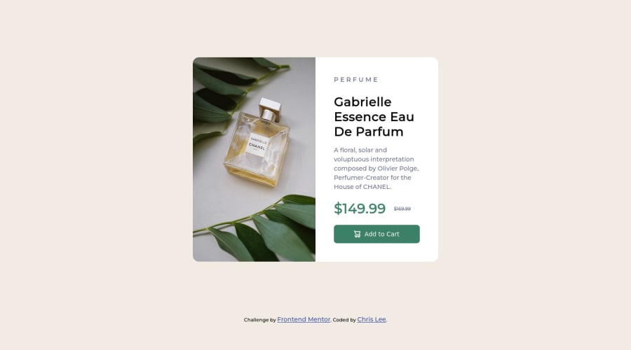
In fact, I find some problems when I style the background image of the product. The size of the image is kind of weird. Therefore, my responsive design may not be good at this moment.
If you can provide some advice on my responsive design and styling background image, I would be appreciated it.
Community feedback
Please log in to post a comment
Log in with GitHubJoin our Discord community
Join thousands of Frontend Mentor community members taking the challenges, sharing resources, helping each other, and chatting about all things front-end!
Join our Discord
