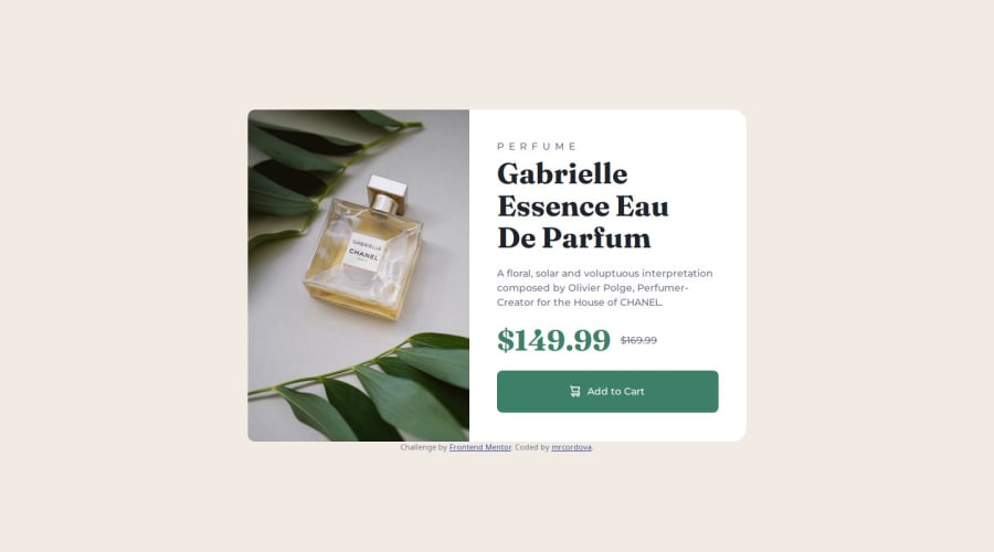
Design comparison
SolutionDesign
Solution retrospective
What are you most proud of, and what would you do differently next time?
I started with a mobile first approach, I would not change a thing.
What challenges did you encounter, and how did you overcome them?I was having trouble getting the image to take half of the space in the card. I figured out I need to put flex: 1 on the picture element instead of the img element because the picture was a flex item.
I welcome any general feedback but one question I had was how to use clamp more effectively. How would I decided what should be the min, best and max and if there some ratio to keep to other text on the screen.
Community feedback
Please log in to post a comment
Log in with GitHubJoin our Discord community
Join thousands of Frontend Mentor community members taking the challenges, sharing resources, helping each other, and chatting about all things front-end!
Join our Discord
