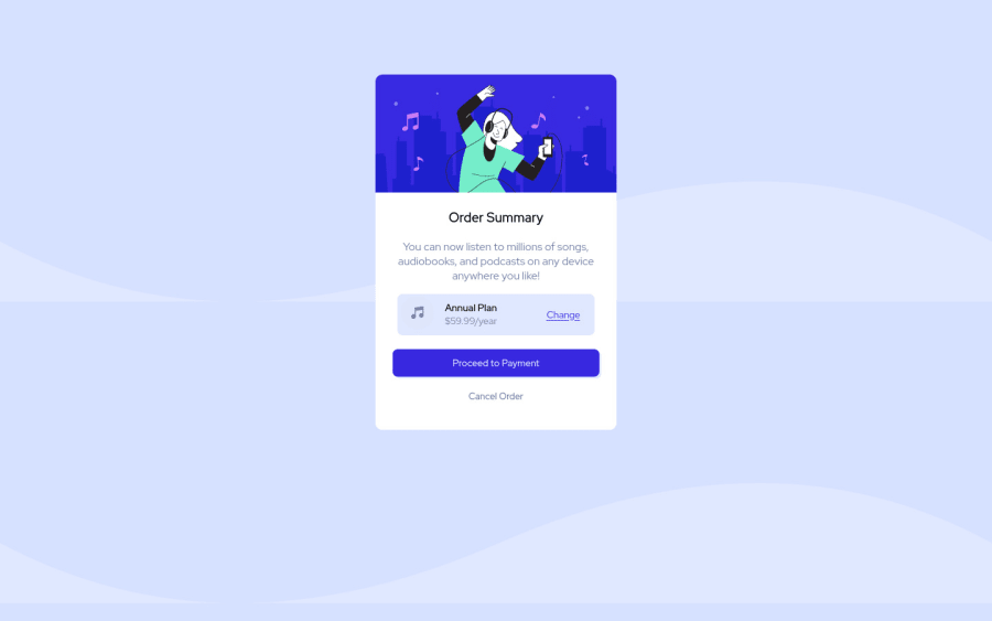
Design comparison
Solution retrospective
Kindly give your suggestions on making the code better.
Community feedback
- @DeolabestPosted about 2 years ago
Hey @naitik-lodha, Congratulations on completing this challenge!
Here is my feedback:
-
It's not a good practice to use px to set font-size. Instead use rem units, they are great since they adapt better to the font-size the user will set in the browser settings. You can convert from px to rem here:
https://pixelsconverter.com/px-to-rem. -
Use <main> instead of a simple <div> to improve the semantics and accessibility on the page. Remember that every page should have a <main> block and that <div> doesn't have any semantic meaning.
Keep doing a good job!
1 -
- @Deevyn9Posted about 2 years ago
Hi Naitik, congrats on completing this project, your solution looks really good. However, the width of the container was set as thus
width: 350px;and due to this, it isn't responsive for screens below 360px. Also, the background image is repeating, you can solve this issue withbackground-repeat: no-repeat;I hope you find this helpful.
Happy coding!
1
Please log in to post a comment
Log in with GitHubJoin our Discord community
Join thousands of Frontend Mentor community members taking the challenges, sharing resources, helping each other, and chatting about all things front-end!
Join our Discord
