Design comparison
SolutionDesign
Community feedback
- @JuanTwoFourPosted 6 months ago
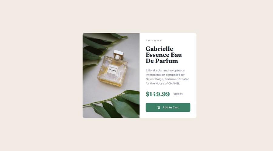
Solution is spot on, size of the card is identical, all content is the right size as well. Only improvement that could be made is adjusting the "card" to be centered on all large screen sizes, not a big issue though, everything still looks and works fine as it should.
0
Please log in to post a comment
Log in with GitHubJoin our Discord community
Join thousands of Frontend Mentor community members taking the challenges, sharing resources, helping each other, and chatting about all things front-end!
Join our Discord
