Design comparison
SolutionDesign
Solution retrospective
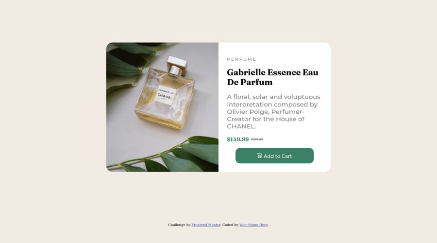
My solution is based on grid so I found difficult the part of sizing correctly both rows/columns in the content box, after a few tries it turn out pretty decent, still not that comfy with it... could be better.
Will continue working on my knowledge improvement and maybe in the future add some spiciness to the design! ;)
Community feedback
- @Raza7522Posted about 2 years ago
You can give the height of 100vh to the body element and it will look proper on screen. And at screen width of nearly 1270px the width is too much, you can consider decreasing it.
Marked as helpful0
Please log in to post a comment
Log in with GitHubJoin our Discord community
Join thousands of Frontend Mentor community members taking the challenges, sharing resources, helping each other, and chatting about all things front-end!
Join our Discord
