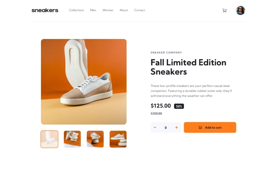
Design comparison
SolutionDesign
Solution retrospective
All feedbacks are appreciated ))
Community feedback
- @ashiqfuryPosted almost 3 years ago
Hi there.. 👋 You done a great work. This solution looks so clean and it looks perfectly like a design.
One point I noticed :
- When I add different items in cart, the cart displays always first item and only one is displayed.
- And reducing the alpha value in
borderon.header-innercontainer make it more pleasant.
Thank you.
Marked as helpful1@Viktoriia-OPosted almost 3 years ago@ashiqfury Hi Fury ) Thank you so much for your advice. I will improve my solution.
0
Please log in to post a comment
Log in with GitHubJoin our Discord community
Join thousands of Frontend Mentor community members taking the challenges, sharing resources, helping each other, and chatting about all things front-end!
Join our Discord
