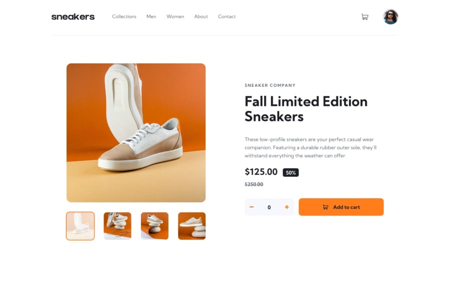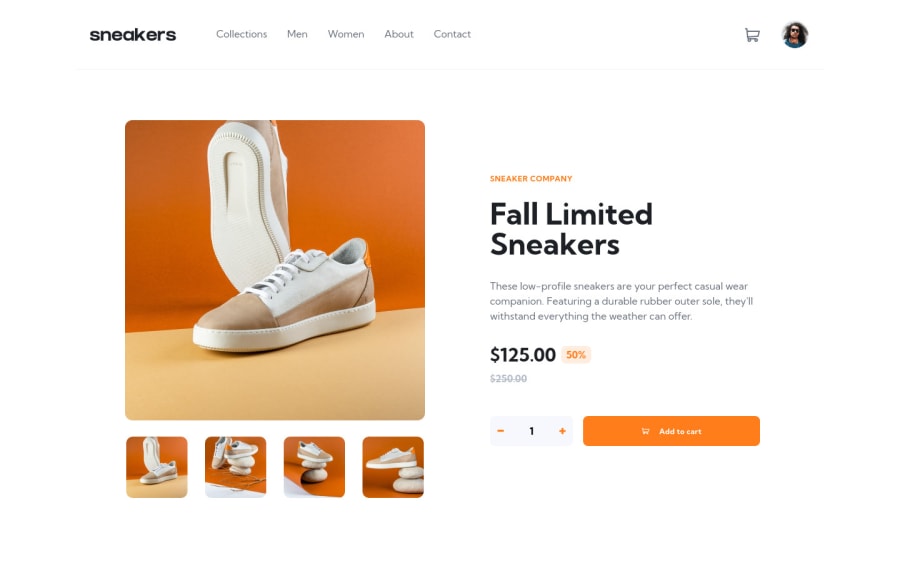
Responsive Product Page using React, Redux, Typescript, Tailwind CSS
Design comparison
Solution retrospective
I need some tips on how I can improve my code, and on making my design responsive.
Community feedback
- @MikevPeerenPosted about 3 years ago
Hey @renras,
Good job on this one.
I think responsiveness is fine, the only problem I saw was that at 320px the menu was loaded already and the images were also shown under the box. I think you didn't keep this mobile device in mind ?
Also for your hover states try to add some transitions, the same goes when switching from images. It feels abrupt now and that's not good user experience. I am also missing a hover cursor on the profile picture.
Also keep in mind when using alt for images if that image will have a benefit for the screenreader, if not you can keep the alt away but if it is you should provide some better alt texts. https://moz.com/learn/seo/alt-text is a good website I found about this.
Marked as helpful2@renrasPosted about 3 years ago@MikevPeeren Yeah, I didn't really have any idea what screen size I should start with. I agree that my work lacks hovers and transitions. Thank you, I'll work on that next time!
0@MikevPeerenPosted about 3 years ago@renras you can use a desktop first or mobile first approach, maybe this can help you with that https://ishadeed.com/article/the-state-of-mobile-first-and-desktop-first/
Marked as helpful1 - @menoo20Posted about 3 years ago
as a frontend, and as I tried your GitHub launch but it didn't open. I will say that mostly I can catch that: 1- some elements tend to rely on the bootstrap's original sizes rather than being customized to fit the real size of the taken screenshot of the original design. like for the above container, I think it must take 1050px max-width. Then you might even find everything else inside it getting closer to the design. I also found that you are not interested in the hover effects and some of the extra-like styling. like the box-shadows made around the card or the "add to cart button". However, reading your code on GitHub, I know you are a true dev. I don't even think that currently I am on your level. I hope to reach your's one day :)
Marked as helpful1 - @renrasPosted about 3 years ago
Thank you for the complement. I'm actually just starting out and not a professional developer yet so that means a lot. Yeah I didn't put much work on the styling side of things. I didn't enjoy css at first but I'm learning to love it now.
1
Please log in to post a comment
Log in with GitHubJoin our Discord community
Join thousands of Frontend Mentor community members taking the challenges, sharing resources, helping each other, and chatting about all things front-end!
Join our Discord