Design comparison
Please log in to post a comment
Log in with GitHubCommunity feedback
- @ericsalvi
Hey @maiaflow,
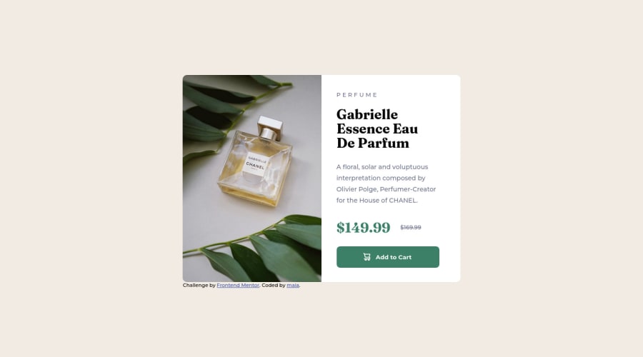
Great job as always. I really do enjoy seeing you complete these challenges. I did notice your URLs were broken in the CSS as you needed to include the correct pathing so I was glad to be able to help fix this offline.
As for the work, I am a fan of keeping things pixel-perfect but I do know that is not practical and it doesn't have to be pixel-perfect.
The use of CSS variables is great. Glad to see you starting to use them. I also noticed that your code is pretty semantic except for the one use of a div in the footer.
It appears to be pretty accessible when using AXE DevTools for checking.
Cannot wait to see your next one completed!
Join our Discord community
Join thousands of Frontend Mentor community members taking the challenges, sharing resources, helping each other, and chatting about all things front-end!
Join our Discord
