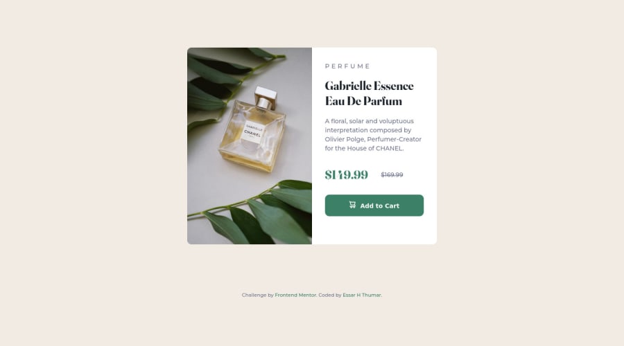
Design comparison
Solution retrospective
The most challenging part for me was to define the Width & Height of the Container and align it to the center. but somehow I was able to complete the challenge successfully. I'm still looking for a better solution for defining the Width & Height of the container.
Drop your Feedback if you find any mistakes or if you feel the code can be improved furthermore in any way.
Community feedback
- @vandermsPosted over 2 years ago
Hi nice work!
Your solution is great and overall I liked it very much.
About the width and height, you could have used a more straightforward approach. I mean, if you needed the card on desktop viewports to have 576px, you should have set the div.main-container to have this width.
But in your solution, you set the body to have 1440px and the div.main_container to have 40% of that. And this is a problem, because it just works if the desktop has exactly this size. For example, on laptops 1280px wide, your site has a horizontal scrollbar because the <body> is overflowing and on desktops with 1980px the card is not in the center.
I think also that you should have used more semantic html tags. I mean, the .main_container could be an article (or a section) not a div.
Marked as helpful1 - @elisavet12Posted over 2 years ago
Hello!
You should try to add to the body: margin: 0 auto; min-height: 100vh;
and you should erase height in the .main-container.
Hope this helps!
Marked as helpful1 - @mubizzyPosted over 2 years ago
Excellent job on this challenge! your report has a few issues though:
- wrap everything in your body in
<main>or use semantics
Hope it helps:)...don't forget to mark it as helpful 👍
0 - wrap everything in your body in
Please log in to post a comment
Log in with GitHubJoin our Discord community
Join thousands of Frontend Mentor community members taking the challenges, sharing resources, helping each other, and chatting about all things front-end!
Join our Discord
