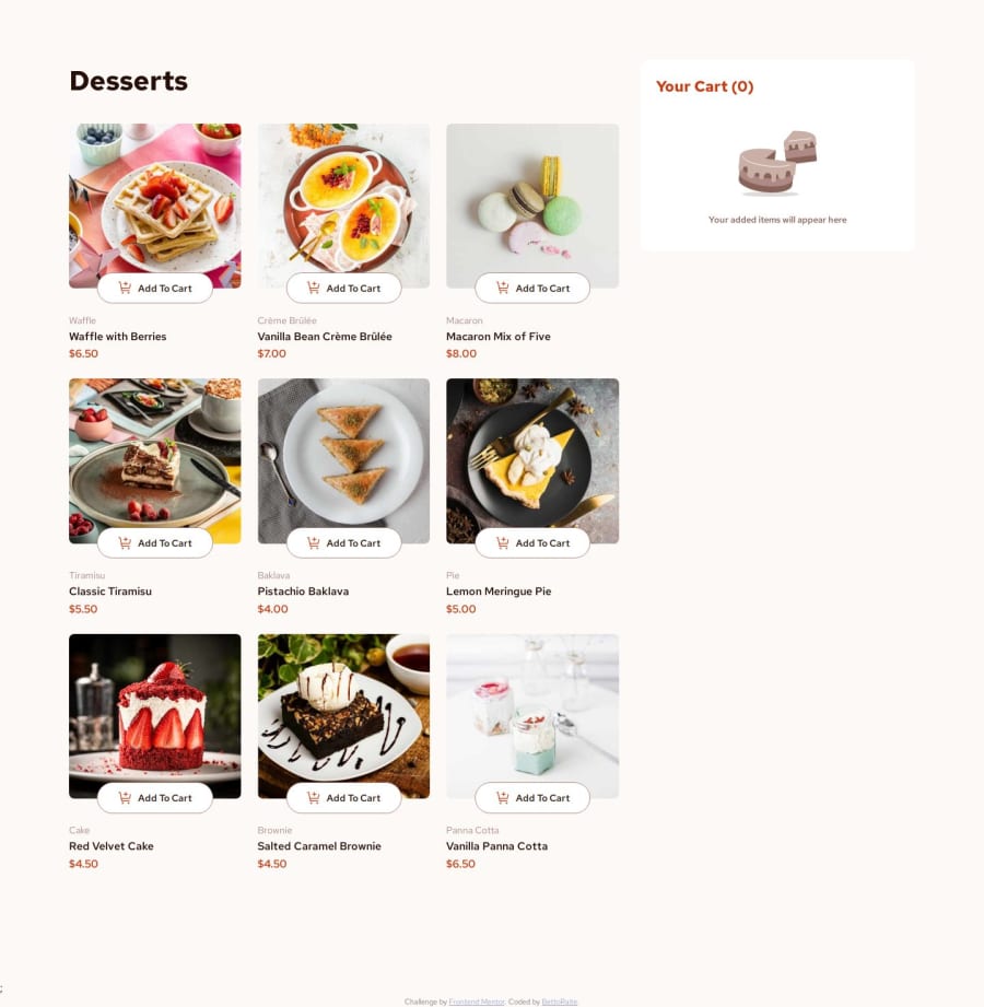
Design comparison
SolutionDesign
Solution retrospective
What are you most proud of, and what would you do differently next time?
- Website is fully responsive for all screen sizes, which is cool.
- This time, unlike all my previous projects, at first I broke down the website logic, the state, which components should be created, depend on that state and change accordingly with it. This in turn helped me to speed up the project building process immensely and not to regret wasting too much time on mindless styling. So, after I built the main skeleton, I quickly moved to the next phase, which is adding styles.
- Media queries, they were a bit pain.
- Have you ever wondered how to make images change its color? I did it using filters.
Community feedback
Please log in to post a comment
Log in with GitHubJoin our Discord community
Join thousands of Frontend Mentor community members taking the challenges, sharing resources, helping each other, and chatting about all things front-end!
Join our Discord
