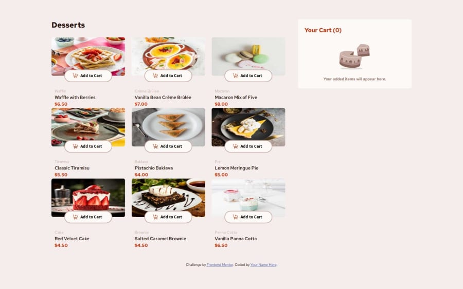
Design comparison
Solution retrospective
I'am very proud of the fact that i used pure vanilla javascript to achieve this i.e no single framework
What challenges did you encounter, and how did you overcome them?The challenges i really encountered was updating the states so that every part of the UI is always in Sync with the states and this was achieve using functions that update the states everywhere, whenever any of the state changes
Community feedback
- @dylan-dot-cPosted 19 days ago
Well done! The overall design and functionality is good! However, there are a few issues that could help you improve.
- Accessibility: This is bad for what you have but I notice that there aren't any focus style for when a button is focused by the keyboard, so its hard to know where a keyboard user would actually be on your website. You can add a little border around elements on focus using the
:focus
psuedoclass. - The modal: The modal is good however a user can still scroll when the modal is open, so what you could do is simple make the html/body element
overflow: hidden
when it's open. Another thing you could do is have a max-height for the order contents so it doesn't overflow and you can see the rest of the modal(when a user buys 1 of everything from the shop). - Shop pictures: There are actually different pictures for each device size(desktop, tablet, phone) they don't really look different but Its mainly the size/aspect ratio that's different. There is an element:
<picture />
that can solve this for you, you can take a look at it and specify different images for different media queries all without CSS/JS. - Fetching the Json file: I took a quick look at the code and saw that you fetched the json file and then used it contents. What you could do is make it a js file say
data.js
and just export the items array(array of js objects) and use that, this reduces any unnecessary code and load times. If this was from a database that changes periodically then you could of course fetch and render but seeing that you know that it's constant you will already have the data before runtime. Also it would be good to remove any code comments you have just to make the file look cleaner.
Otherwise everything is good and all the best with the refactoring!
I've also completed this challenge(not perfect) and used vue but you could still look at some of the components and see the html code I used(it might help). Take care.
Marked as helpful0@Drslope-99Posted 18 days agothank you very much sir, really appreciate the detail feedback will improve on that someother time @dylan-dot-c
1 - Accessibility: This is bad for what you have but I notice that there aren't any focus style for when a button is focused by the keyboard, so its hard to know where a keyboard user would actually be on your website. You can add a little border around elements on focus using the
Please log in to post a comment
Log in with GitHubJoin our Discord community
Join thousands of Frontend Mentor community members taking the challenges, sharing resources, helping each other, and chatting about all things front-end!
Join our Discord