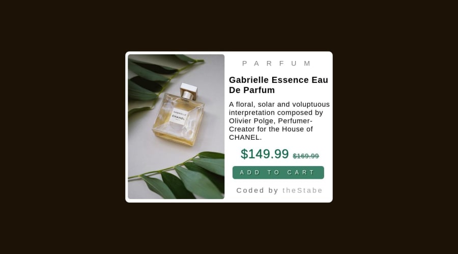
Design comparison
Solution retrospective
any one can simply add their images and text and they are good to go with the template
Community feedback
- @HassiaiPosted over 1 year ago
Replace <div class = "product"> with the main tag and <h4> with <h1> to make the content/page accessible. click here for more on web-accessibility and semantic html
Every html must have <h1> to make it accessible. Always begin the heading of the html with <h1> tag wrap the sub-heading of <h1> in <h2> tag, wrap the sub-heading of <h2> in <h3> this continues until <h6>, never skip a level of a heading.
The body has a wrong background-color. Use the colors and font-families that were given in the styleguide.md found in the zip folder you downloaded.
There is no need to give the body a width. To center .product on the page using flexbox, replace the height in the body with min-height: 100vh.
body{
min-height: 100vh;
display: flex;
align-items: center;
justify-content: center;
}
For a responsive content, give .product a max-width of 500px which is 31.25rem/em.
in the desktop design, give . p-img and .p-details a width/flex-basis of 50% and in the media query give them width/flex-basis of 100%.
Hope am helpful.
Well done for completing this challenge. HAPPY CODING
0 - @MatanskiPosted over 1 year ago
A creative approach to the project not bad. but I would suggest you to try to implement responsiveness to the website, and add a media query for max-width so it would look cleaner. other than that, good job!
0
Please log in to post a comment
Log in with GitHubJoin our Discord community
Join thousands of Frontend Mentor community members taking the challenges, sharing resources, helping each other, and chatting about all things front-end!
Join our Discord
