Submitted about 2 years ago
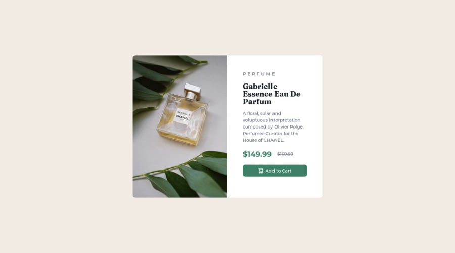
Responsive Product Component preview using Flexbox.
@kiran1095
Design comparison
SolutionDesign
Solution retrospective
- I have got better at using rem units and flex, but I wanted to learn when I can use flex and grid at which instance for effective designing of layout.
Thanks in advance for any feedback on how I can improve my code better for this design, and for any layout if I have to follow any particular patterns to be more effective.
Thanks.
Community feedback
Please log in to post a comment
Log in with GitHubJoin our Discord community
Join thousands of Frontend Mentor community members taking the challenges, sharing resources, helping each other, and chatting about all things front-end!
Join our Discord
