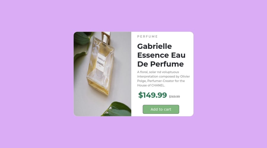
Responsive Product Cart using HTML,CSS AND BOOTSTRAP.
Design comparison
Community feedback
- @MelvinAguilarPosted almost 2 years ago
Hello there 👋. Good job on completing the challenge !
I have some suggestions about your code that might interest you.
Metadata 🗃️:
- The
viewportmeta tag is missing. theviewportmeta tag is used to control the layout of the page on mobile devices. Add theviewportmeta tag to the<head>tag:<meta name="viewport" content="width=device-width, initial-scale=1.0">
HTML 📄:
- Wrap the page's whole main content in the
<main>tag.
- The
altattribute is used to provide a text description of the image which is useful for screen reader users, assistive technology users, and search engine optimization. Improve thealtattribute to the<img>tag of the product.
-
Avoid using uppercase text in your HTML because screen readers will read it letter by letter. You can use the
text-transformproperty to transform the text to uppercase in CSS.The word "perfume" is written as separate letters, which does not convey the meaning that this text is a single cohesive unit of content. This can be confusing for users and for screen readers, as it can be difficult to understand the meaning of the text.
Example:
<p>Perfume</p>

p {
    text-transform: uppercase;
    letter-spacing: 0.3em;
}
CSS 🎨:
- Instead of using pixels in font-size, use relative units like
emorrem. The font-size in absolute units like pixels does not scale with the user's browser settings. You can read more about this here 📘.
- Use
min-height: 100vhinstead ofheight: 100vh. Theheightproperty can cause your component to be cut off on small screens, such as a mobile phone in landscape mode.
I hope you find it useful! 😄
Happy coding!
2 - The
Please log in to post a comment
Log in with GitHubJoin our Discord community
Join thousands of Frontend Mentor community members taking the challenges, sharing resources, helping each other, and chatting about all things front-end!
Join our Discord
