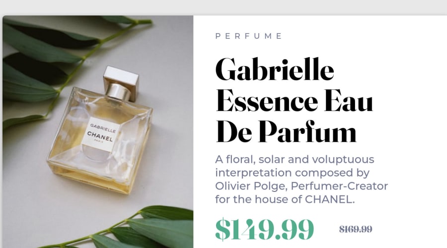
Design comparison
Solution retrospective
I had a tough time building the desktop version because my container which contained all of the text refused to align in the center of the free space to the right of the image. Eventually I think I figured out that it was because I used transform-scale() on the image which seems to keep the original div size even though the image size increases.
Edit: Looking at the solutions of others, I'd like to say mine is pretty accurate and its a plus that I included the mobile version too. But... IT'S TOO BIG! LOL. Seriously... I thought that because the design file specified 1440px of width that it meant my preview page was meant to be that size...
Community feedback
Please log in to post a comment
Log in with GitHubJoin our Discord community
Join thousands of Frontend Mentor community members taking the challenges, sharing resources, helping each other, and chatting about all things front-end!
Join our Discord
