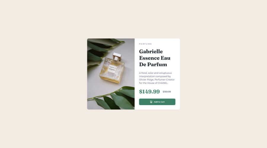
Not Found
Not Found
Not Found
Not Found
Not Found
Not Found
Not Found
Not Found
Not Found
Not Found
Not Found
Not Found
Not Found
Not Found
Not Found
Not Found
Not Found
Not Found
Not Found
Not Found

Submitted

Responsive Product Cards | HTML & CSS

Corey 70

@cjay44

Desktop design screenshot for the Product preview card component coding challenge

This is a solution for...

  • HTML
  • CSS
1newbie
View challenge

Design comparison


SolutionDesign

Solution retrospective


Another one done! Trying to use logical properties more, and keeping in mind of semantics.

What other properties should I look at/into when designing for responsiveness?

Any feedback is welcome!

Thank you!

Community feedback

@VCarames

Posted

Hey @cjay44, great job on this project!

To make it easier to deal with CSS and have more control over your content, I suggest taking a look at CSS Resets.

It makes it easier to make changes and will ensure that everything will look the same regardless of browser used and don’t have to worry that the browser will be using its own styling.

One important thing about CSS Resets, is that there is no such thing as “one is better than the other.”

CSS Resets are customizable for your preference.

Here are few CSS Resets that you can look at and use to create your own CSS Reset or just copy and paste one that already prebuilt.

https://www.joshwcomeau.com/css/custom-css-reset/

https://meyerweb.com/eric/tools/css/reset/

http://html5doctor.com/html-5-reset-stylesheet/

Happy Coding!

Marked as helpful

0

Corey 70

@cjay44

Posted

@vcarames Thank you! i've been meaning to look into resets

0
Lucas 👾 104,420

@correlucas

Posted

👾Hello @cjay44, Congratulations on completing this challenge!

Your solution its almost done and I’ve some tips to help you to improve it:

I saw that you’ve used flexbox to place the content and create the layout.

I think the best way to build this component with two columns is by using GRID LAYOUT since it is simpler to manage the columns and then create the media query for mobile. Here’s the steps to create it with grid create the main block to hold all the content (you can use <main> to wrap), set its width as max-width: 900px (it's the container size) and display: grid / grid-template-column: 1fr 1fr(this means that your component will have two columns with 50% of the container width each thats 450px). To manage the column with the text use flexbox and gap to give it the spacing between the texts or use padding-bottom to separate them.

Then to create the mobile version, all you need to do is to change the container flow vertically with grid-template-column: 1fr.

Using <picture> you’ve more control over the elements and its better than using the product image as <img> or background-image. Look that for SEO and search engine reasons it isn't a better practice to import this product image with CSS since this will make it harder to the image. You can manage both images inside the <picture> tag and use the html to code to set when the images should change setting the device max-width depending of the device (phone / computer) Here’s a guide about how to use picture: https://www.w3schools.com/tags/tag_picture.asp

✌️ I hope this helps you and happy coding!

1

Corey 70

@cjay44

Posted

@correlucas Thank you! I've actually just started using/learning grid a bit more recently. Using flexbox to center containers is just so easy - it's kind of a habit of mine. I think in my next project I will try to use grid for the layout. Interesting about the <picture> tag! I will keep that in mind when using images in the future.

I appreciate the feedback! 😁

0
Corey 70

@cjay44

Posted

Looks like I got the width/height a little off - Those figma files would be nice

1

Please log in to post a comment

Log in with GitHub
Discord logo

Join our Discord community

Join thousands of Frontend Mentor community members taking the challenges, sharing resources, helping each other, and chatting about all things front-end!

Join our Discord