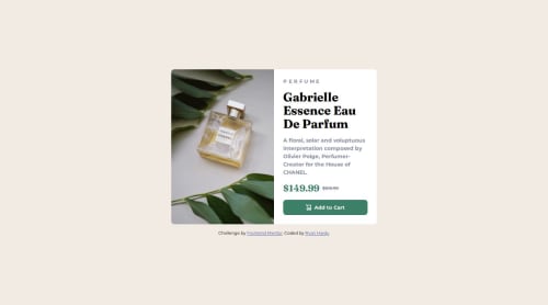
Responsive product card with the help of Flexbox

Solution retrospective
I am proud of how I leveraged Flexbox to handle the layout change between desktop and mobile. It made it so I only needed to write one line of CSS in the media query to make the layout horizontal (switching the flex-direction to row).
What challenges did you encounter, and how did you overcome them?Scaling images is something I have trouble with. This time, it was a challenge on the desktop design. At first, I tried using flex-grow and flex-shrink to give the image the same width as the text container, but that didn't work. I eventually found a much easier way which was setting each of those elements' widths to 50% in the media query.
What specific areas of your project would you like help with?There is a small issue with the image scaling that happens between screen widths of 375px and 530px. I was wondering why that is happening and how to fix it.
Also, is there a better way to name my CSS variables? I feel like I'm doing that wrong.
Please log in to post a comment
Log in with GitHubCommunity feedback
No feedback yet. Be the first to give feedback on Ryan Hardy's solution.
Join our Discord community
Join thousands of Frontend Mentor community members taking the challenges, sharing resources, helping each other, and chatting about all things front-end!
Join our Discord