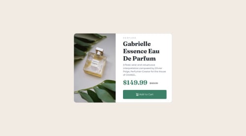
Responsive product card with bootstrap 5

Solution retrospective
I tried using only relatives values for font-size for the website to be as responsive as I could. I will start learning tailwind soon as I found that bootstrap classes made it difficult to get the specific result I was going for. I tried incorporating a main element and sections as was recommended to me on previous projects.
What challenges did you encounter, and how did you overcome them?I struggled a lot with changing from one image to the other and changing the layout with bootstrap. I did manage to figure it out, but I would like to figure out more efficient ways of doing it. It was also suggested to me to try to download the fonts instead of importing them, but that didn't work out when I tried it :(
What specific areas of your project would you like help with?I'm trying to find ways to simplify the code as some of it is a bit janky.
Please log in to post a comment
Log in with GitHubCommunity feedback
No feedback yet. Be the first to give feedback on Xavier O.'s solution.
Join our Discord community
Join thousands of Frontend Mentor community members taking the challenges, sharing resources, helping each other, and chatting about all things front-end!
Join our Discord