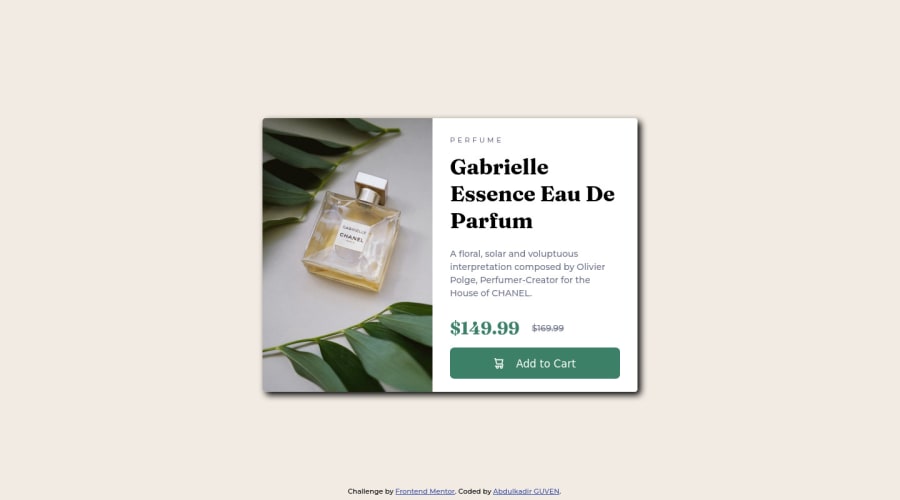
Not Found
Not Found
Not Found
Not Found
Not Found
Not Found
Not Found
Not Found
Not Found
Not Found
Not Found
Not Found
Not Found
Not Found
Not Found
Not Found
Not Found
Not Found
Not Found
Not Found

Submitted

Responsive Product Card using Sass.

@abguven

Desktop design screenshot for the Product preview card component coding challenge

This is a solution for...

  • HTML
  • CSS
1newbie
View challenge

Design comparison


SolutionDesign

Solution retrospective


Please don't hesitate to let me know if you've problems with displaying the site. I would be gratefull if you could give me a feed back about best practices that i could omitted or any other advises about the project.

Community feedback

Elaine 11,400

@elaineleung

Posted

Hi Abdulkadir, welcome to Frontend Mentor, and well done on your first challenge!

I think you did a number of things well here, including using flexbox for the layout, using the picture element and also including the object-fit in your image. Some other feedback/suggestions I have that might help you out:

  1. I notice that you have a position: fixed for your footer. Is it because you wanted to make sure it's at the bottom? I think it's fine if the background isn't transparent because at screen sizes where the height is small, the footer can overlap with the card, and then not only is the text hard to read, the text is also covering the card. If your goal is just to have the footer at the bottom and not necessarily fixed to the screen, then you can use flexbox on the body for positioning, which helps with centering the card and also pushing the footer to the end when you add flex:1 to .container. You also have flexbox on .container already, so for vertical alignment, you can just add align-items: center. It all looks like this:

    body {
       min-height: 100vh; // change height to min-height
       display: flex;
       flex-direction: column;
    }
    .container {
       align-items: center;  // this is for vertical alignment
       flex: 1; // this is for occupying all the space and pushing the footer to the bottom
       // rest of your code
    }
    // remove fixed properties from footer
    
  2. There's a scrollbar here when it doesn't need to be, and it's because the browser is using the default margin settings. I recommend adding reset/normalize rules to every project so that the styles can be consistent in different browsers; you can look into Andy Bell's CSS reset, which is what I use. Anyway, for here as a start, try to add this to the top of your sheet as a reset rule:

    * {
       box-sizing: border-box;
       margin: 0;
       padding: 0;
    }
    
    
  3. To have the image and text at 50%, it won't be enough to have width: 50% on the text; since you're using flexbox, you can try adding flex: 1 0 50% on the image as well.

That's all for now, and once again, great job here, and hope to see more solutions coming!

Marked as helpful

2

@abguven

Posted

@elaineleung Thank you very much for this helpfull feed-back. Not being able to set width property as i wish in flex elements was one of the problems i was facing a lot.

0

@Jorggyh

Posted

Hello, good job!

The first thing I noticed is that at 1440px or above the card is vertically centered, but at 1339px or below the card is aligned on top. Try to make all versions center aligned.

Another thing, the mobile version is being displayed up to 375px, at 376px the desktop version is already displayed, but the space is too small for it, I don't know if anyone would see it in this resolution but for security I would change this exchange point to 670px at least .

If you need help let me know.

Marked as helpful

2

@abguven

Posted

@Jorggyh Thank you very much.

0
Lucas 👾 104,420

@correlucas

Posted

👾Hello Abdulkadir GUVEN, congratulations for your first solution!👋 Welcome to the Frontend Mentor Coding Community!

Great solution and great start! By what I saw you’re on the right track. I’ve few suggestions to you that you can consider to add to your code:

1.The box-shadow is a bit too evident, this is due the opacity and blur. The secret to create a perfect and smooth shadow is to have low values for opacity and increase blur try this value instead: box-shadow: 12px 7px 20px 6px rgb(57 75 84 / 8%);

If you’re not familiar to box-shadow you can use this site to create the shadow design and then just drop the code into the CSS: https://html-css-js.com/css/generator/box-shadow/

2.You did a good work putting everything together in this challenge, something you can do to improve the image that needs to change between mobile and desktop is to use <picture> instead of <img> wrapped in a div. You can manage both images inside the <picture> tag and use the html to code to set when the images should change setting the device max-width depending of the device (phone / computer) Here’s a guide about how to use picture: https://www.w3schools.com/tags/tag_picture.asp

✌️ I hope this helps you and happy coding!

Marked as helpful

1

@abguven

Posted

@correlucas First of all, I would like to thank you for your welcome message. I'm very happy joining a such reactive and amazing community. I appreciate the time you committed for this detailed and constructive feedback.I just uploaded the new version on github. Have an amazing day

1
Lucas 👾 104,420

@correlucas

Posted

@abguven I'm happy to hear that Abdulkadir! I hope to see more of your projects here. Keep it up =)

1

Please log in to post a comment

Log in with GitHub
Discord logo

Join our Discord community

Join thousands of Frontend Mentor community members taking the challenges, sharing resources, helping each other, and chatting about all things front-end!

Join our Discord