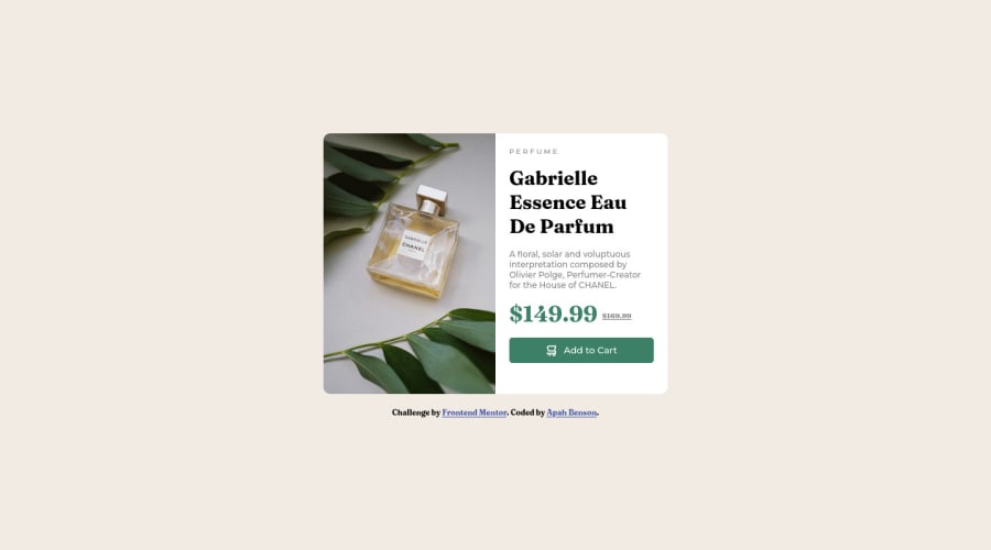
Design comparison
SolutionDesign
Solution retrospective
Still learning about how to eliminate unwanted spaces in the body element for a centralized item within it like this card in media query when trying to make it responsive for mobile
Community feedback
Please log in to post a comment
Log in with GitHubJoin our Discord community
Join thousands of Frontend Mentor community members taking the challenges, sharing resources, helping each other, and chatting about all things front-end!
Join our Discord
