

Design comparison

Solution retrospective
Welp, this project didn't go as smooth as I expected, but overall design is fine imo.
What specific areas of your project would you like help with?Image scaling and card sizing please!
Community feedback
- @neirucodePosted 7 months ago
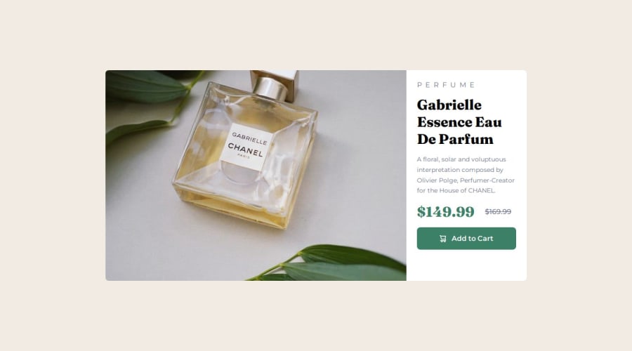
ur code is looking great overall, but there are a few things you could tweak to make it even better. First off, the alt text for your images could be more descriptive. Instead of leaving the cart icon's alt text empty, try using something like "shopping cart icon" for better accessibility. For the perfume image, something like "Product image of Gabrielle Essence Eau De Parfum" would be more informative.
Also, it’s better to use a <button> element for the "Add to Cart" section instead of a div. This ensures proper interaction for screen readers and keyboard navigation, which is a simple change that can really improve accessibility.
When it comes to the prices, consider wrapping the current price in a <strong> tag and the old price in a <del> tag. This would make the discount clearer and provide better semantics.
In terms of your CSS, it’s always a good idea to have a full CSS reset to handle browser inconsistencies. You could also add fallback fonts in case Google Fonts don't load properly. Switching your mobile image to dynamically replace rather than using it as a background image would also be better for performance.
Lastly, you could use relative units like rem or em for font sizes, padding, and margins to improve responsiveness. And instead of repeating class names in your CSS, just combine them into one block for better readability.
Overall, the structure is solid, but with these small fixes, you’ll have a more accessible, performant, and maintainable codebase!
Marked as helpful0

Please log in to post a comment
Log in with GitHubJoin our Discord community
Join thousands of Frontend Mentor community members taking the challenges, sharing resources, helping each other, and chatting about all things front-end!
Join our Discord