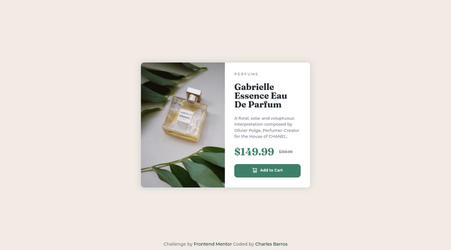
Responsive Product Card - SASS, CSS3 and HTML5


Design comparison

Solution retrospective
This is my proposal of solution to the Product Card Challenge and was my third non-tutorial project in frontend carrer. As the two first, this challenge consists of creating a simple static page using the jpg design file as reference and implementing only HTML5 and CSS3, but in this challenge I had to use new responsiveness concepts such as Media Query in CSS, because the Challenge's Style Guide asked me for two different layouts, one to Desktop and other to Mobile. Again a project with great learning, where I was able to apply and strengthen all the knowledge acquired with the previous challenges and add new important knowledge about SASS pre-processor, use of partials and responsivness with Media Queries.
Community feedback
Please log in to post a comment
Log in with GitHub
Join our Discord community
Join thousands of Frontend Mentor community members taking the challenges, sharing resources, helping each other, and chatting about all things front-end!
Join our Discord