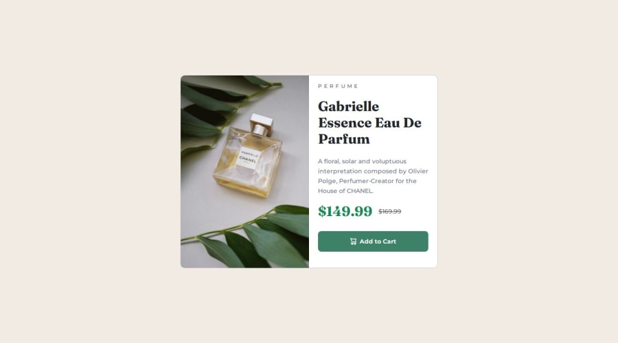
Responsive Product Card Preview using Bootstrap


Design comparison

Solution retrospective
I am most proud of pushing through the challenge and successfully incorporating Bootstrap into my project. It allowed me to streamline my styling process and focus on responsive design. Next time, I would spend more time planning how to balance using Bootstrap’s utility classes with custom CSS, which could make my code even more efficient and cleaner.
What challenges did you encounter, and how did you overcome them?I would appreciate any feedback that can help improve my code structure, especially in terms of optimizing the use of Bootstrap classes and responsive design techniques. Any suggestions for better media query management or improving code readability would also be valuable.
What specific areas of your project would you like help with?-
I faced challenges in deciding where to focus on Bootstrap’s built-in classes versus adding my own custom styles. It took some time to strike the right balance, but I eventually refined my approach by experimenting with both.
-
Another challenge was adjusting the media queries for responsiveness on smaller devices. I overcame this by tweaking the layout in Bootstrap and writing specific custom media queries to ensure a smooth experience on mobile screens.
Community feedback
Please log in to post a comment
Log in with GitHub
Join our Discord community
Join thousands of Frontend Mentor community members taking the challenges, sharing resources, helping each other, and chatting about all things front-end!
Join our Discord