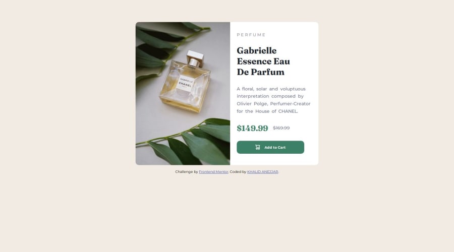
Design comparison
Community feedback
- @gabbyhunter1Posted 4 months ago
You have done a good job! Though I am absolutely not an expert, I would like to share something with you:
- Maybe you have already known this before, but just in case - another way to achieve replacing the image for larger screens(or smaller, depends on your approach) would be srcset.
<source srcset="./images/image-product-desktop.jpg" media="(min-width: 600px)" />But be aware that this feature, as of 11.18.2024, is not supported in the good ol’ Internet Explorer.
- To center the card on the whole page, you need to, first of all, remove these properties from your .container:
.container{
    ...
    margin: 0 auto;
    margin-top: 5rem;
    ...
}
And, secondly, add these to your body:
body {
    ...
    height: 100vh;
    display: flex;
    flex-direction: column;
    align-items: center;
    justify-content: center;

}
And yeah, you can remove the selection of the html tag since it is not necessary, I guess. Or you could select the html tag and apply these properties, but I do not really think it is considered a good practice. You could either try your .container or .section__card as well, but I, personally, would go with body, so I'll explain the whole thing with it.
As we try to center the card on the whole page, we must add the
height: 100vhproperty to the selected thing, since the body tag only expands to fit its content, so using thatheight: 100vhproperty ensures that the body tag spans the full height of the viewport, hence we use vh(stands for viewport height) in order to achieve what we need on every possible screen size.Also, I think you know this one thing, but I will say it just in case you do not - we cannot use percents here, because percentage height depends on the parent element’s height, which in your case is almost the same thing + the attribution div. That would not center the card on the whole viewport.
-
And now, speaking of the attribution div, - you could use the footer tag for it to make your HTML code look more semantic.
-
Replace the
max-width: 300pxproperty inside your.card__img imgselector withmax-width: 100%. That fixes the overflow when the viewport width is between 375 and 500-ish pixels.
Good luck with your web development journey! :)
Marked as helpful1P@khalidanejjarPosted 4 months ago@gabbyhunter1 Hi Gabby!!I really appreciate your time reading my code and thanks your comment! I will take those notes and try it on my code! Thanks again
1 - @MiboooPosted 4 months ago
Try centering the container in the center of the screen with Flex box
Marked as helpful0P@khalidanejjarPosted 4 months ago@Mibooo It is centered horizontally using margin auto left and right ```.container{ background-color: var(--white-color); max-width: 580px; /* height: 500px; / margin: 0 auto; margin-top: 5rem; border-radius: 10px; position: relative;/ Hides anything outside the container */ overflow: hidden;
}
0
Please log in to post a comment
Log in with GitHubJoin our Discord community
Join thousands of Frontend Mentor community members taking the challenges, sharing resources, helping each other, and chatting about all things front-end!
Join our Discord
