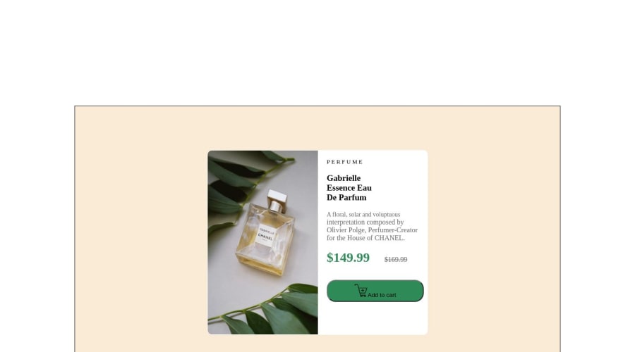
Design comparison
Solution retrospective
I found it quite difficult to align some of the text, mainly the prices.
I was unable to align them as it is in the design and I tried using margins and padding but neither worked.
It also took me quite a while to figure out how to make the page responsive. However, I believe I finally figured that out and did a good job. I ended up having to make a separate code for all sections for mobile and desktop in HTML. This made it a lot easier to style the content in CSS.
Community feedback
- @rachidbendPosted over 1 year ago
Hi, great work by the way, in the start it can be difficult to know how you can do something but we still have to try.
I think a great thing to learn is how to separate a design into multiple components which can help quite a bit in styling it, for example, you put the image everything in a box because that part can be a component, but instead of writing the rest into a paragraph, you could have split them, you could have put 'PERFUME' into an <h3> or another paragraph by itself, the put the title below it into an <h1> tag, and the paragraph into a <p> element instead of putting them all in a single <p> element and splitting them with <span> and <br>, you would have not needed them anyways. basically try to think of what are the parts in a design, and if they should be put into a single tag (like how the image and the rest of the text are inside the box element) or separated into multiple tags (like how the title should be in a <h1> tag by itself).
i see that you wrote two different versions in the HTML, but here's another way you could have implemented it using CSS grid, inside the box element, put the image inside a <div>, and the rest of the text into another div next to the first, and use CSS grid on the box (display: grid) and (grid-template-columns: 1fr 1fr) so that it each would take half of the box, and in the media query, bellow 700px for example or wherever you want to see it, add this style on the box (grid-template-columns: 1fr)(grid-template-rows: 1fr 1fr) to change their placements, then you wouldn't need to use HTML for the mobile, you can do it in CSS only.
sorry if this was too much or unclear, and if you want to see a code example of what I said I can provide it. good luck.
Marked as helpful0@lem31Posted over 1 year ago@rachidbend
Thank you for your helpful comments! It would be great if you could send me an example of using the CSS grid, so I can use a CSS grid on my next challenge 😊
0
Please log in to post a comment
Log in with GitHubJoin our Discord community
Join thousands of Frontend Mentor community members taking the challenges, sharing resources, helping each other, and chatting about all things front-end!
Join our Discord