Design comparison
SolutionDesign
Solution retrospective
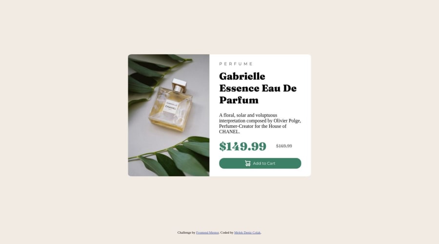
I used HTML and CSS to make this responsive product card. Figuring out dimensions so that the content was not overflowing from the card was difficult. Any tips on how to make sure your text and buttons stay within the card are welcome, or any feedback really!
Community feedback
- @Randall3475Posted over 1 year ago
Hello Deniz, you are using explicit heights and widths, these are not responsive, therefore causing your elements to overflow (flow out of their container).
It is preferred to use max- and min heights or widths.
1
Please log in to post a comment
Log in with GitHubJoin our Discord community
Join thousands of Frontend Mentor community members taking the challenges, sharing resources, helping each other, and chatting about all things front-end!
Join our Discord
