Design comparison
Solution retrospective
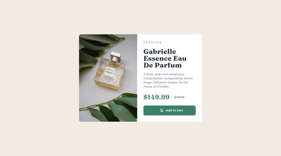
Wonderful challenge for a newbie! I couldn´t place the icon properly. I came up with a dubious solution using grid. Can anyone point me in the right direction? I'm interested in making it accesible but not sure how to. Any suggestions? Since this is my first challenge feedback is always welcome!
Community feedback
- @amparoamparoPosted almost 2 years ago
Hola de nuevo! :)
Glad it was helpful.
Do you mean for screen readers? You could do something like adding a <span> and making it only visible for screen readers. See https://a11y-guidelines.orange.com/en/web/components-examples/accessible-hiding/.
I think I wrote something like "Reduced from " as the hidden text on my solution.
Hope that helps!
Marked as helpful0 - @amparoamparoPosted almost 2 years ago
Hola Lorena!
Great job! It looks pretty much the same as the original.
For the button, I'd say flexbox would probably work better. At least that's what I did when I completed this challenge 😅. That way the text and the icon will be centered more easily, and it will look better when resizing the viewport.
I'm no expert, but from what I understand, you'd use grid for things that are more rigid, like layouts, where you want the parent to be in control; and flexbox for things that are meant to be FLEXible, like page components, where the children will be more independent.
The other details I would work on to make it look exactly like the original would be:
- making the heading slightly smaller,
- increasing the line height for the main/paragraph text, and
- fixing the layout so that the two sides are the same size (on desktop).
Did you have any specific questions about accessibility? You can fix the error showing on your report by adding an empty alt tag (alt=""), since the icon is only decorative and doesn't need to be communicated to screen reader users 😊
Keep up the good work! 👏
Marked as helpful0@LorenaFriasPosted almost 2 years ago@amparoamparo
Hola Amparo! Gracias! I truly appreciate your feedback! I'd like to add a <p> (or some other one) stating the original price before the crossout one. I tried removing it out of the flow with a class but the browser's reader failed to read it. Any suggestions?
0
Please log in to post a comment
Log in with GitHubJoin our Discord community
Join thousands of Frontend Mentor community members taking the challenges, sharing resources, helping each other, and chatting about all things front-end!
Join our Discord