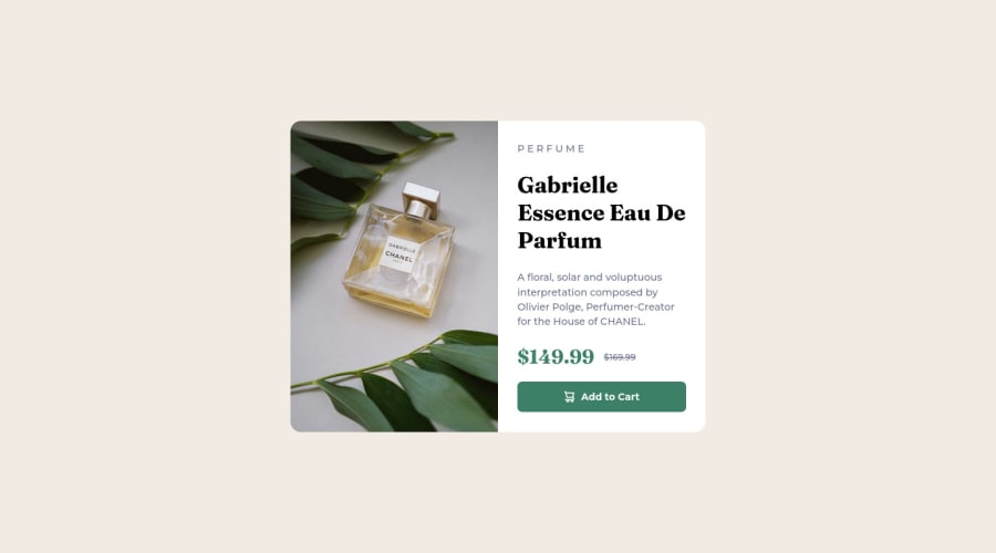
Not Found
Not Found
Not Found
Not Found
Not Found
Not Found
Not Found
Not Found
Not Found
Not Found
Not Found
Not Found
Not Found
Not Found
Not Found
Not Found
Not Found
Not Found
Not Found
Not Found

Submitted

Responsive product card component using Flexbox

Tainara 30

@tainarapalmeira

Desktop design screenshot for the Product preview card component coding challenge

This is a solution for...

  • HTML
  • CSS
1newbie
View challenge

Design comparison


SolutionDesign

Solution retrospective


Hello, this is my first time here. Throughout this challenge, it was difficult to position elements and set a correct dimension. Especially in the mobile version, depending on the screen size, the "Add to cart" button may disappear. If you have any feedback on how I can improve, feel free to contact me, I would love to hear your feedback. Any contribution will be really valuable to me!

Community feedback

Lucas 👾 104,440

@correlucas

Posted

👾Hello Tainara, Congratulations on completing this challenge!

Your solution its almost done and I’ve some tips to help you to improve it:

Use the THE PICTURE TAG that is a shortcut to deal with the multiple images in this challenge. So you can use the <picture> tag instead of importing this as an <img> or using a div with background-image. Use it to place the images and make the change between mobile and desktop, instead of using a div or img and set the change in the css with display: none with the tag picture is more practical and easy. Note that for SEO / search engine reasons isn’t a better practice import this product image with CSS since this will make it harder to the image. Manage both images inside the <picture> tag and use the html to code to set when the images should change setting the device max-width depending of the device desktop + mobile.

Check the link for the official documentation for <picture> in W3 SCHOOLS: https://www.w3schools.com/tags/tag_picture.asp

See the example below:

<picture>
  <source media="(max-width:650px)" srcset="./images/image-product-mobile.jpg">
  <img src="./images/image-product-desktop.jpg" alt="Gabrielle Parfum" style="width:auto;">
</picture>

👨‍💻Here's my solution for this challenge if you wants to see how I build it: https://www.frontendmentor.io/solutions/product-preview-card-vanilla-css-and-custom-hover-state-on-hero-dVGWpOTgWS

✌️ I hope this helps you and happy coding!

Marked as helpful

1

Tainara 30

@tainarapalmeira

Posted

@correlucas opa, Lucas, muito obrigada mesmo pela dica! :) Com certeza vou ajustar e trabalhar melhor a imagem com essa tag. Sua solução desse desafio está sensacional! haha parabéns e, mais uma vez, valeuzão pela força!

0

@ShannTimothy22

Posted

Congratulation on finishing the challenge 🥳 , your solution looks great and there's no accessibility issues and html issues, I have a suggestion

• The container seems to have fixed height, it makes your content can't fit in the container you can fix that by removing the fixed height after that add some padding-bottom to your button container and the problem is fixed

If there’s still any problem I recommended you watch Kevin Powell on youtube, the channel will help you a lot on your coding journey, other than that good job on finishing the challenge and happy coding 😁!!

Marked as helpful

1

Tainara 30

@tainarapalmeira

Posted

big thanks, @ShannTimothy22! Definitely I'm going to try to fix that :) Thank you so much for your help and happy coding!

0

Please log in to post a comment

Log in with GitHub
Discord logo

Join our Discord community

Join thousands of Frontend Mentor community members taking the challenges, sharing resources, helping each other, and chatting about all things front-end!

Join our Discord