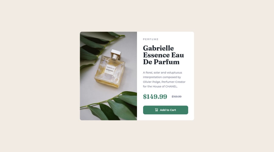
Design comparison
Solution retrospective
I'm starting to learn CSS and sometimes I'm not sure if it's ok to use absolute units or if I should try to avoid them and always use relative units. In this solution, I tried using relative units for width and height but it was breaking on tablet screens so I ended up using pixels.
Other than that, I would really appreciate any feedback you can give me. I used flexbox and media query to make the page responsive
Community feedback
- @visualdennissPosted over 1 year ago
Great work! Congrats completing the challenge successfully.
To answer your question about units: try to avoid using px as much as you can, instead try to use em or rem to improve accessibility. Here is a great resource on YT for clarifying all the differences between rem/em: https://www.youtube.com/watch?v=dHbYcAncAgQ
Also i'd suggest adding a background-color change on hovering the button to indicate interactivity to the users.
Hope you find this feedback helpful!
Marked as helpful1 - @RoanMacmillanPosted over 1 year ago
Looks awesome well done. Consider using a h1 tag for the main heading, there's a few reasons why this is important:
-
Accessibility: Having a clear and descriptive <h1> heading can improve the accessibility of your webpage. For example, screen readers will use the <h1> heading to provide an overview of the content on the page.
-
Search engine optimization: Search engines use the <h1> tag to determine the main topic of the page.
-
User experience: A clear and prominent <h1> heading can help users understand what your page is about and quickly find the information they are looking for.
Marked as helpful1 -
Please log in to post a comment
Log in with GitHubJoin our Discord community
Join thousands of Frontend Mentor community members taking the challenges, sharing resources, helping each other, and chatting about all things front-end!
Join our Discord
