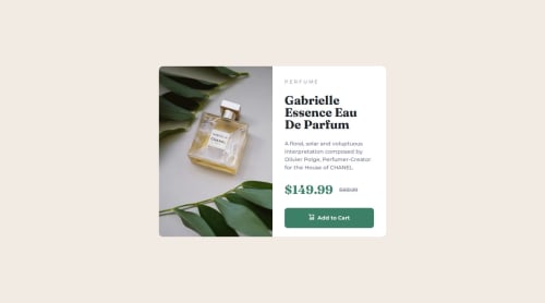
Responsive Product card

Solution retrospective
Getting the responsive elements working together and using BEM for more consistent HTML.
What challenges did you encounter, and how did you overcome them?The main challenge i had was around centering the cards, eventually settled on a flexbox approach to both mobile and desktop approach.
The figma file was not consistent in the product details spacing which present a challenge in providing consistencies. So its not absolutely pixel perfect for that reason but from a UI perspective is more consistent.
What specific areas of your project would you like help with?HTML semantic structure CSS structure and general CSS feedback on where i can improve
Please log in to post a comment
Log in with GitHubCommunity feedback
No feedback yet. Be the first to give feedback on Aaron Smith's solution.
Join our Discord community
Join thousands of Frontend Mentor community members taking the challenges, sharing resources, helping each other, and chatting about all things front-end!
Join our Discord