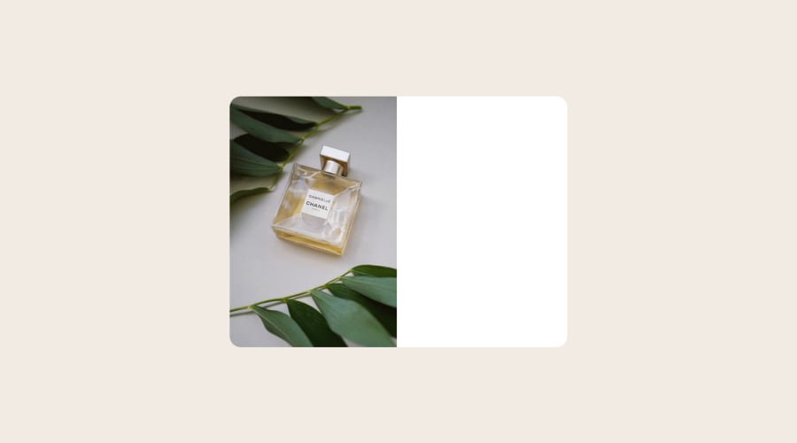
Design comparison
Community feedback
- @petritnurediniPosted 10 months ago
Congratulations on completing your project! Your implementation of responsive design using custom hooks and separate components for mobile and desktop is commendable. Here are a few recommendations to enhance your project further:
-
Code Reusability:
- Consolidate Common Elements: Look for common elements in
MobileandDesktopcomponents to create a single reusable component. This reduces code duplication.
- Consolidate Common Elements: Look for common elements in
-
Accessibility:
- Alt Text for Images: Ensure all images have descriptive
altattributes. For the cart icon, you can usealt="Cart Icon".
- Alt Text for Images: Ensure all images have descriptive
-
CSS and Styling:
- Consistent Naming: Stick to a consistent naming convention in CSS. For example, if you are using BEM, ensure all your classes follow that format.
-
Performance Optimization:
- Lazy Loading Images: Consider lazy loading images for improved performance, especially for larger images.
-
Responsive Design:
- Media Queries: Instead of a JavaScript-based approach for responsiveness, consider using CSS media queries. This can often be more efficient and maintain cleaner code.
-
Code Organization:
- Modular CSS: If your project grows, consider using CSS modules or styled-components for better scalability and maintainability.
-
Learning Resources:
- Responsive Web Design: MDN Web Docs
- React Performance: React Official Docs
Keep up the great work! Each project is a stepping stone towards becoming a more proficient developer. Continue exploring and experimenting with different approaches and techniques.
Marked as helpful0 -
- @VCaramesPosted about 2 years ago
Hey @germanp007, some suggestions to improve you code:
-
In desktop view your text is being pushed outside the card, you want to go back and fix that.
-
The Alt Tag Description for the image needs to be improved upon. You want to describe what the image is; they need to be readable. Assume you’re describing the image to someone.
-
This challenges requires you to use two images for different breakpoints. To properly achieve this, you want to use <picture> element.
Syntax:
  <picture>
    <source media="(min-width: )" srcset="">
    <img src="" alt="">
  </picture>
Source:
https://www.w3schools.com/html/html_images_picture.asp
https://web.dev/learn/design/picture-element/
-
There is only one heading in this challenge and that is the name of the perfume, “Gabrielle Essence Eau De Parfum”.
-
The old price is not being announced properly to screen readers. You want to wrap it in a Del Element and include a sr-only text explaining that this is the old price.
-
A lot of the headaches and repeated properties can be be overcome by implementing a proper CSS Reset.
Here are few CSS Resets that you can look at and use to create your own or just copy and paste one that is already prebuilt.
https://www.joshwcomeau.com/css/custom-css-reset/
https://meyerweb.com/eric/tools/css/reset/
http://html5doctor.com/html-5-reset-stylesheet/
Happy Coding!
Marked as helpful0 -
Please log in to post a comment
Log in with GitHubJoin our Discord community
Join thousands of Frontend Mentor community members taking the challenges, sharing resources, helping each other, and chatting about all things front-end!
Join our Discord
