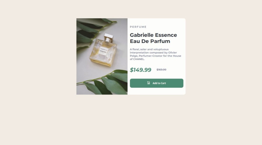
Design comparison
SolutionDesign
Solution retrospective
What are you most proud of, and what would you do differently next time?
The time taken to complete the task, which is less than usual, shows that I am getting the hang of it.
What challenges did you encounter, and how did you overcome them?still the centering of my main content.
What specific areas of your project would you like help with?centering
Community feedback
- @joeyturboPosted 12 months ago
Hey this looks great. A few things I would change:
- the Fraunces font didn't appear to make it over.
- limit the height of the card to accommodate space between text in desktop view
- add a little more padding to the text in desktop view
great work!
0
Please log in to post a comment
Log in with GitHubJoin our Discord community
Join thousands of Frontend Mentor community members taking the challenges, sharing resources, helping each other, and chatting about all things front-end!
Join our Discord
