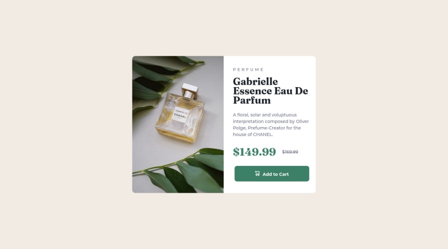
Design comparison
Solution retrospective
All feedback is welcomed. I am still very new to coding. I hope to improve my front-end skills by completing challenges and reading the feedback from the community. :)
Community feedback
- @correlucasPosted over 2 years ago
👾Hello @im7ven, Congratulations on completing this challenge!
Your solution its almost done and I’ve some tips to help you to improve it:
Use the THE PICTURE TAG that is a shortcut to deal with the multiple images in this challenge. So you can use the
<picture>tag instead of importing this as an<img>or using a div withbackground-image. Use it to place the images and make the change between mobile and desktop, instead of using adivorimgand set the change in the css withdisplay: nonewith the tag picture is more practical and easy. Note that for SEO / search engine reasons isn’t a better practice import this product image with CSS since this will make it harder to the image. Manage both images inside the<picture>tag and use the html to code to set when the images should change setting the devicemax-widthdepending of the device desktop + mobile.Check the link for the official documentation for
<picture>in W3 SCHOOLS:https://www.w3schools.com/tags/tag_picture.aspSee the example below:
<picture> <source media="(max-width:650px)" srcset="./images/image-product-mobile.jpg"> <img src="./images/image-product-desktop.jpg" alt="Gabrielle Parfum" style="width:auto;"> </picture>👨💻Here's my solution for this challenge if you wants to see how I build it: https://www.frontendmentor.io/solutions/product-preview-card-vanilla-css-and-custom-hover-state-on-hero-85A1JsueD1
✌️ I hope this helps you and happy coding!
0 - @VCaramesPosted over 2 years ago
Hey @im7ven, some suggestions to improve you code:
-
The Alt Tag description for the image needs to be improved upon. You want to describe what the image is; they need to be readable. Assume you’re describing the image to someone.
-
When using images that are different size for different breakpoints, its’ far more effective to use the <picture> element. By using this element not are able to use different size images, you can also save on bandwidth, meaning your content loads faster.
Syntax:
  <picture>
    <source media="(min-width: )" srcset="">
    <img src="" alt="">
  </picture>
Source:
https://www.w3schools.com/html/html_images_picture.asp
https://web.dev/learn/design/picture-element/
-
The "shopping cart" icon is decorative, so its Alt Tag needs to be left blank.
-
The old price is not being announced properly to screen readers. You want to wrap it in a Del Element and include a sr-only text explaining that this is the old price.
-
A lot of the headaches and and repeated properties can be be overcome by implementing a proper CSS Reset.
This is not enough:
* {
  box-sizing: border-box;
}
Here are few CSS Resets that you can look at and use to create your own or just copy and paste one that is already prebuilt.
https://www.joshwcomeau.com/css/custom-css-reset/
https://meyerweb.com/eric/tools/css/reset/
http://html5doctor.com/html-5-reset-stylesheet/
Happy Coding!
0 -
Please log in to post a comment
Log in with GitHubJoin our Discord community
Join thousands of Frontend Mentor community members taking the challenges, sharing resources, helping each other, and chatting about all things front-end!
Join our Discord
