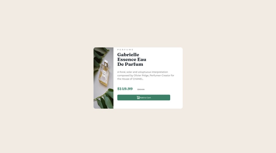
Design comparison
Solution retrospective
-> faced issues with flexbox and responsive design. -> I'm unsure about the responsiveness code. -> how should I make this code responsive and better?
Community feedback
- @MelvinAguilarPosted almost 2 years ago
Hello there 👋. Good job on completing the challenge !
I have some suggestions about your code that might interest you.
HTML 📄:
- Wrap the page's whole main content in the
<main>tag.
- Avoid using uppercase text in your HTML because screen readers will read it letter by letter. You can use the
text-transformproperty to transform the text to uppercase in CSS.
- The
altattribute is used to provide a text description of the image which is useful for screen reader users, assistive technology users, and search engine optimization. Add thealtattribute to the<img>tag of the product.
-
The image does not change on mobile devices. You can use the
<picture>tag when you have different versions of the same image 🖼. Using the<picture>tag will help you to load the correct image for the user's. You can read more about this here 📘.Example:
<picture>
    <source media="(max-width: 450px)" srcset="./images/image-product-mobile.jpg">
    <img src="./images/image-product-desktop.jpg" alt="{your alt text goes here}">
</picture>
CSS 🎨:
- The
width: 100%property in thebodytag is not necessary. Thebodytag is a block element and it will take the full width of the page by default.
- Use
min-height: 100vhinstead ofheight: 100vh. Theheightproperty will not work if the content of the page grows beyond the height of the viewport.
-
Remove the large padding and margin from the body element, on mobile devices this causes its component to move out of place. screenshot
@media only screen and (max-width: 450px)
  body {
    /* padding: 50px; */
    /* margin: 100px; */
    . . .
  }
}
-
The best way to create two columns in CSS is to use the grid layout 📐. Using the grid layout, you can create two columns by setting the display property of the parent element to grid and then defining the number of columns you want with the
grid-template-columnsproperty.Example:
.quote-box {
    width: 450px;
    /* NOTE: Remove flexbox to create the two columns and the height is unnecessary. */
    /* height: 320px; */
    /* display: flex; */
    /* flex-direction: row; */
    background-color: white;
    border-radius: 10px;
    /* padding-right: 15px; */
   /*  NOTE: Creates two columns with equal width 📐 */
    display: grid;
    grid-template-columns: 1fr 1fr;
}

@media only screen and (max-width: 450px) {
 .quote-box {
    /* flex-direction: column; */
    /* height: fit-content; */
    /* width: 380PX; */
    /* padding: 0px; */
    /* NOTE: On mobile devices, change from two columns to one. */
    grid-template-columns: 1fr;
 }

 .product {
    /* width: 100%; */
    /* height: 10%; */
    . . .
 }
}
I hope you find it useful! 😄 Above all, the solution you submitted is great!
Happy coding!
Marked as helpful1@hady68Posted almost 2 years ago@MelvinAguilar Thanks a whole lot Melvin this was really useful feedback, appreciate it!
1 - Wrap the page's whole main content in the
- @Mr-jawPosted almost 2 years ago
Hello there 👋
HTML 📄
-
replace
<div class="quote-box">with<main>tag to fix accessibility issues. -
Always provide
<img>tag with meaningful and humanly understandable text about what the image is in thealtattribute.
CSS 🎨
- Use relative units like
remoremfor margins, paddings, widths, and heights. most preferablyremfor font sizing.
Also to fix the responsiveness and mobile view issues. try making these changes;
HTML
replace the
<img src="images/image-product-desktop.jpg" class="product">with,<img src="images/image-product-desktop.jpg" class="product desktop"> <img src="images/image-product-mobile.jpg" class="product mobile">CSS
-
In
bodyelement replaceheight: 100vh;withmin-height: 100vh;. -
In
.productreplacewidthwithmax-width: 100%; -
add these lines of code
.product.mobile { display: none }- Next, in
@media only screen and (max-width: 450px)inside thebodyelement removepadding: 50px;andmargin: 100px;, And add these two lines of code
.product.desktop { display: none } .product.mobile { display: block }- In
.productreplaceborder-radius: 10px;withborder-radius: 10px 10px 0 0;
Now it should look great 🔥👍
Hope this was helpful 😊
KEEP GRINDING
Marked as helpful0 -
Please log in to post a comment
Log in with GitHubJoin our Discord community
Join thousands of Frontend Mentor community members taking the challenges, sharing resources, helping each other, and chatting about all things front-end!
Join our Discord
