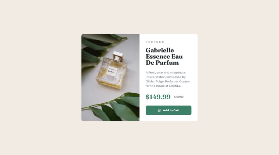
Design comparison
Solution retrospective
Next time I wanna try 'mobile-first' aproach.
What challenges did you encounter, and how did you overcome them?I was really struggle with making flexbox working as I need to. But looks like tamed it for this time.
Community feedback
- @StroudyPosted about 1 month ago
Exceptional work! You’re showing great skill here. I’ve got a couple of minor suggestions that could make this stand out even more…
- These
<span>
should really have semantic tags like headings (<h1> to <h6>
) and paragraphs (<p>
) convey structure and meaning to content, improving accessibility, SEO, and readability by helping search engines and screen readers interpret the content.
<span class="product-category montserrat-medium">Perfume</span>
-
Using a full modern CSS reset is beneficial because it removes default browser styling, creating a consistent starting point for your design across all browsers. It helps avoid unexpected layout issues and makes your styles more predictable, ensuring a uniform appearance on different devices and platforms, check out this site for a Full modern reset
-
Using
rem
orem
units in@media
queries is better thanpx
because they are relative units that adapt to user settings, like their preferred font size. This makes your design more responsive and accessible, ensuring it looks good on different devices and respects user preferences.
@media (max-width: 650px)
- For future project, You could download and host your own fonts using
@font-face
improves website performance by reducing external requests, provides more control over font usage, ensures consistency across browsers, enhances offline availability, and avoids potential issues if third-party font services become unavailable. Place to get .woff2 fonts
I hope you’re finding this guidance useful! Keep refining your skills and tackling new challenges with confidence. You’re making great progress—stay motivated and keep coding with enthusiasm! 💻
Marked as helpful1 - These
- @anamaydevPosted about 1 month ago
Hey @CaplexW, I came across your CSS and it looked beautiful and super clean! I’d really appreciate it if you could take a look at my code and give me some feedback on where I can improve. Thanks so much!
0
Please log in to post a comment
Log in with GitHubJoin our Discord community
Join thousands of Frontend Mentor community members taking the challenges, sharing resources, helping each other, and chatting about all things front-end!
Join our Discord