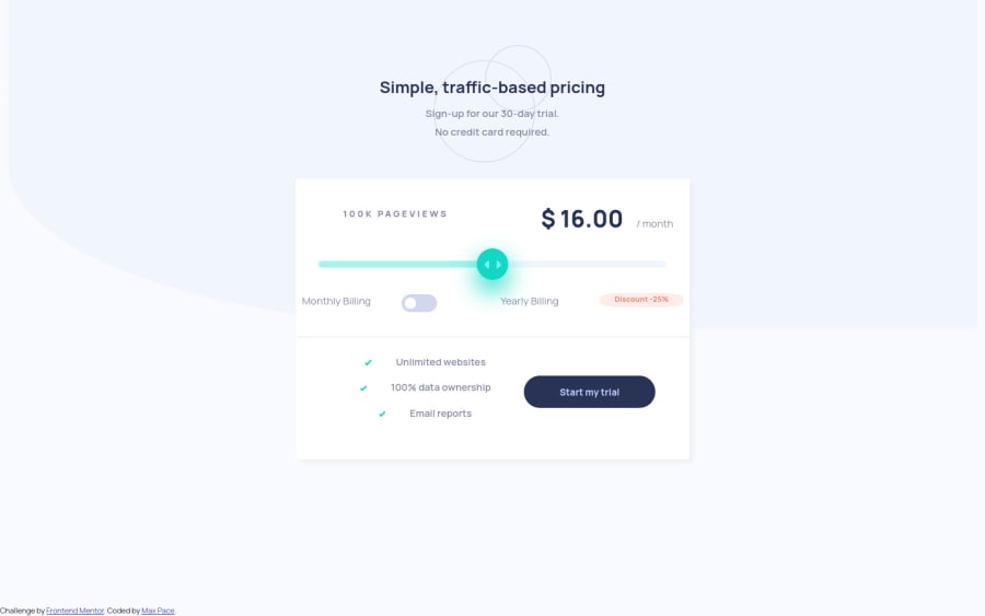
Responsive Pricing Element - Bootstrap and Vanilla JS
Design comparison
Solution retrospective
I am not able to find a proper solution to the lack of a -webkit equivalent for the pseudoclasses
::-moz-range-track vs ::-moz-range-progress
Therefore the graphical effect of the bar being colored on the left of the thumb is not working on chrome.
P.S. Please note I'm a self-taught dev! If there's anything you think I should learn to optimize, let me know it!
Community feedback
- @MohamilrPosted almost 4 years ago
Hi,
you can use prefix free for compatibility issues. here https://ibrahimdamy7.medium.com/use-prefix-free-fd07e7e7dbea
1@PsycheMaxPosted almost 4 years ago@Mohamilr Thanks for pointing that out - the problem is that this particular pseudo class doesn't exist with the -webkit prefix.
There's no "progress bar" for a range selector on -webkit browsers, as far as I could tell from the docs I've read
0@MohamilrPosted almost 4 years ago@PsycheMax I understand what you mean now. it's an open issue on W3C now https://github.com/w3c/csswg-drafts/issues/4410
1 - @Luci-netizenPosted almost 4 years ago
Hi! Good job! How did you manage to add the color for moved slider? I can see it from the screenshot of your solution, although on the published site it does not change. btw, this is my solution so far https://luci-netizen.github.io/challenges/
0@PsycheMaxPosted almost 4 years ago@Luci-netizen It just works on Firefox and Edge, but not on webkit based browsers. For the other browsers, I used the pseudoclasses -moz-range-track and -ms-fill-upper and -ms-fill-lower
It's actually the biggest issue I faced here.
0@MohamilrPosted almost 4 years ago@Luci-netizen I used box-shadow to achieve this. but I ended up not having the right display for the range thumb.
https://mohamilr.github.io/learn-frontend/interactive-pricing-component.html
note that I set the overflow of range to hidden.
0@Luci-netizenPosted almost 4 years ago@Mohamilr I see.. but then how do you put the shadow on the slider wheel?
0@MohamilrPosted almost 4 years ago@Luci-netizen I don't know if it's okay to share my code. but see line 80 to 82 https://github.com/Mohamilr/learn-frontend/blob/master/interactive-pricing-component.html
You might need to increase the pixels of the box-shadow depending on the width of your range input.
0@Luci-netizenPosted almost 4 years agoI was curious about the second shadow (of turqoise color), which is casted downwards by the wheel.
0
Please log in to post a comment
Log in with GitHubJoin our Discord community
Join thousands of Frontend Mentor community members taking the challenges, sharing resources, helping each other, and chatting about all things front-end!
Join our Discord
