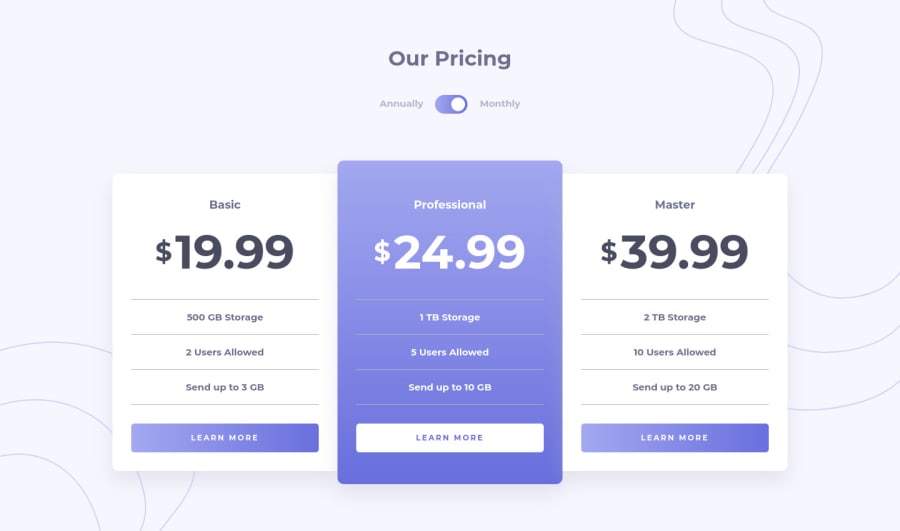
Responsive pricing component using Sass, BEM, and JS for the toggle

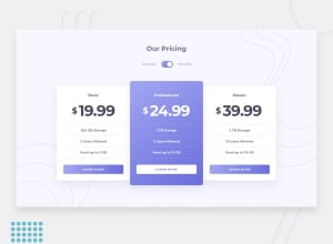
Design comparison
Solution retrospective
Hello!
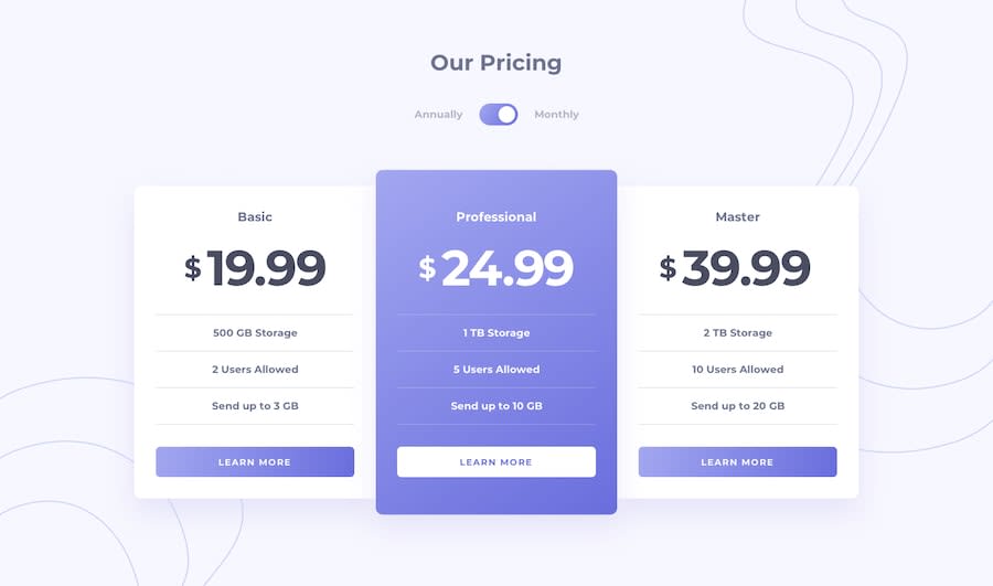
I tried my best to match the design in this challenge. Used some semantic markup for the elements as well. Do check out my approach to switch the billing from monthly to annually in the app.js file.
I also designed a new responsive attribution footer for myself which I have put in this solution, and will be adding to all my future solutions, so I would like some thoughts on that as well!
Thanks!
Community feedback
- @ApplePieGiraffePosted almost 4 years ago
Hi, Syed Ali Mansoor! 👋
Good job on this challenge! 👏
I only suggest adding a focused state to the toggle-switch so that users know when it is the active item on a page. 😉
Your attribution section looks pretty great, BTW! 👍 I really wasn't expecting something like that but it's cool! 😎
Keep coding (and happy coding, too)! 😁
1@syedalimansoorPosted almost 4 years ago@ApplePieGiraffe Thanks APG! I'll work on adding that focused state.
Happy coding to you too!
0 - @pikapikamartPosted almost 4 years ago
Hey, great work on this one, the layout is really good and the toggle works just fine. Though I suggest making it accessible via keyboard presses only, so supporting tabbings right. I am refactoring my solution on this to approach that, but if you were to consider it, check out Grace Snow' solution on this, it is really accessible for all and it is really an amazing solution.
For that custom footer, well for me personally, that works well and good choice in color picking, for me okay. Points for that
Suggestion/s would be that;
-
At point 1097px going down to the mobile breakpoint, there is a scrollbar at the bottom. Since your content are bigger, then overflowing appears, thus creating scrollbar. Check that one out. Referring to toggled state, for the untoggled, no scrollbar.
-
The text besides the toggle could have been a label for the toggle. It will be really good if they were label right, so that it can used to toggle it as well.
So those two only, more like preferences.
Overall, this is a really good work^^
1@syedalimansoorPosted almost 4 years ago@pikamart Thank you so much pikamart. I'll look into the issues you mentioned and work on them.
0 -


Please log in to post a comment
Log in with GitHubJoin our Discord community
Join thousands of Frontend Mentor community members taking the challenges, sharing resources, helping each other, and chatting about all things front-end!
Join our Discord