Design comparison
SolutionDesign
Solution retrospective
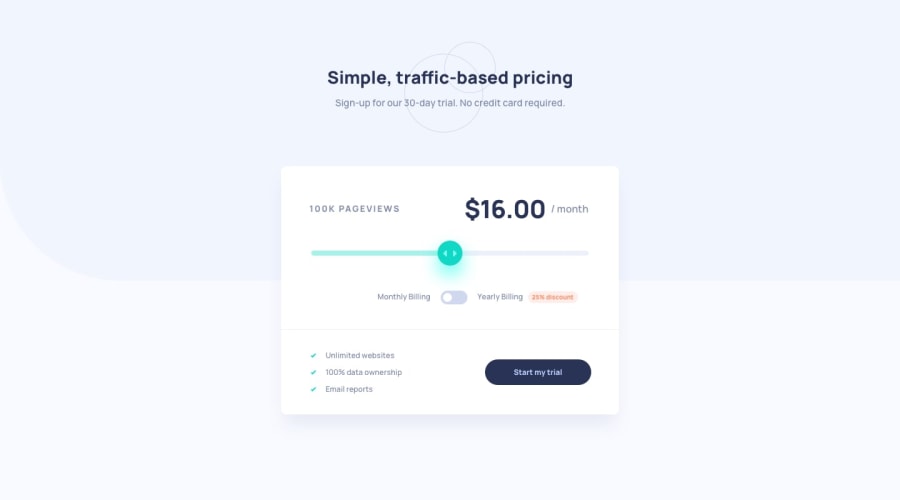
hey y'all this is my solution to interactive pricing component
i didnt add given background image because on large screen size it was too short to cover whole screen and on small screen it was too large, however i could've used background size to cover, but as screen width changes it shrinks
if you have any solution regarding above problem please leave some advice and feedback !
might add some design and transition in future !
Community feedback
Please log in to post a comment
Log in with GitHubJoin our Discord community
Join thousands of Frontend Mentor community members taking the challenges, sharing resources, helping each other, and chatting about all things front-end!
Join our Discord
