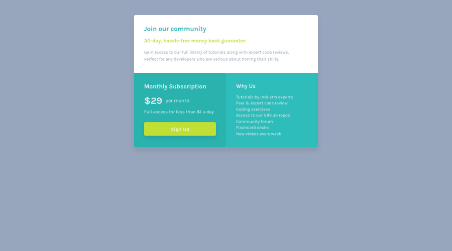
Design comparison
Solution retrospective
I found difficult structuring my HTML classes and containers properly. I'm unsure of the css i wrote because i tried using mobile first approach and I don't know if i did it right. I would appreciate if you checked out my code and gave me your opinion. I would be happy to hear what I can improve.
Community feedback
- @VCaramesPosted about 2 years ago
Hey there! 👋 Here are some suggestions to help improve your code:
- To center you content to your page, add the following to your Body Element:
body { min-height: 100vh; display: grid; place-content: center; }- The “30-day, hassle-free money back guarantee” is not a heading. It should instead be wrapped in a Paragraph Element.
If you have any questions or need further clarification, let me know.
Happy Coding! 👻🎃
Marked as helpful0 - @AdrianoEscarabotePosted about 2 years ago
Hi Kajetan Kowalski, how are you?
I really liked the result of your project, but I have some tips that I think you will enjoy:
- every Html document must contain the main tag, so we can identify the main content, to fix this, wrap all the content with the main tag. HTML5 landmark elements are used to improve navigation experience on your site for users of assistive technology.
- To align some content in the center of the screen, always prefer to use
display: flex;it will make the layout more responsive!
Example:
body {
    margin: 0;
    padding: 0;
    display: flex;
    align-items: center;
    justify-content: center;
    min-height: 100vh;
}
The rest is great!
I hope it helps... 👍
Marked as helpful0
Please log in to post a comment
Log in with GitHubJoin our Discord community
Join thousands of Frontend Mentor community members taking the challenges, sharing resources, helping each other, and chatting about all things front-end!
Join our Discord
