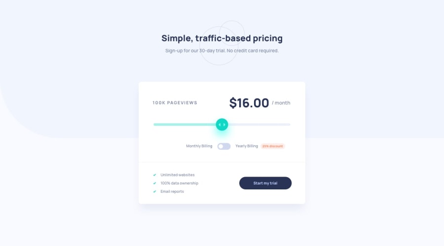
Design comparison
Solution retrospective
Hello All, This is my first Frontend Mentor React project. I took an online course that introduced me to React some months back but haven't had a chance to try creating and deploying a project in the wild yet.
For this project I implemented the design using only two functional components. If you see any improvements that can be made feel free to mention them.
Since this project was mainly used for me to get my feet wet using React I only have one explicit question. Does anyone have any resources on the best way to deploy a React app to Github pages?
Usually I use the web interface as outlined at this web page: https://medium.com/frontend-mentor/a-complete-guide-to-submitting-solutions-on-frontend-mentor-ac6384162248
I had some trouble getting my React app deployed to Github Pages and ended up getting it working using a convoluted method that I'm sure can be improved upon.
Here are two other web pages that I initially used to guide my code deployment: https://dev.to/yuribenjamin/how-to-deploy-react-app-in-github-pages-2a1f
https://www.pluralsight.com/guides/deploying-react-on-github-pages
Moving forward I want to get more comfortable with deploying React code to Github Pages but in this case I figured done is better than perfect for my first project.
Thanks to all who have helped so far. And Thanks
Community feedback
- @MiculinoPosted almost 3 years ago
Congrats on completing the challenge, @shangum!
It came out looking nice and the input range works as expected.
On certain smaller resolutions, the background you set on the body looks a bit weird. Might want to give that a second look.
Also, the range button doesn't have that cyan shadow and the gray border should be a bit softer, so try changing its color.
Regarding the hosting of your code, if you want a simpler solution, you can try out Vercel. I use it all the time for my Frontend Mentor projects https://vercel.com/
Marked as helpful0@shangumPosted almost 3 years agoHey @Remus432 ,
I appreciate the feedback. I'll take a look at the body background and give the colors you specified another review.
Also thank you for the Vercel recommendation. I haven't heard of it before but will definitely check it out.
Thanks again!
0 - @shangumPosted almost 3 years ago
Resubmitted this challenge here: https://www.frontendmentor.io/solutions/interactive-pricing-component-using-react-and-sass-UiWQExOca
0
Please log in to post a comment
Log in with GitHubJoin our Discord community
Join thousands of Frontend Mentor community members taking the challenges, sharing resources, helping each other, and chatting about all things front-end!
Join our Discord
