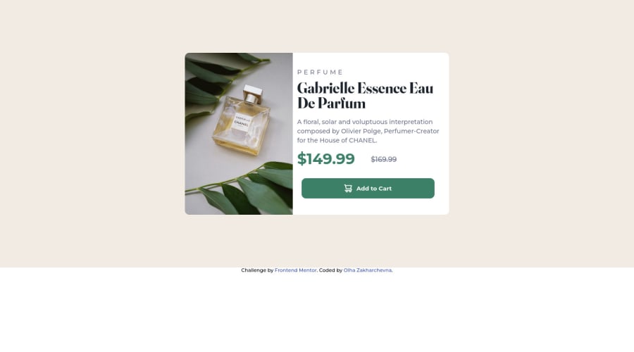
Responsive preview product card using flex-box, grid
Design comparison
Solution retrospective
Why there are different heights of flex items (img and content) between 550px screen-width-630px screen-width?
Community feedback
- @Khalid-debuggPosted over 2 years ago
Firstly, congrats for your solution you really did a great job. I recommend that you put the background color to the body element not to the products section, and also make the body as a flexbox. like: ''' body{ background-color: whatever; display: flex; flex-direction: column; justify-content: center; align-items: center height: 100vh; } '''
Marked as helpful0@zakharchevnaPosted over 2 years ago@Khalid-debugg Thank you so much for answering. I’ll try your recommendations. It was my first challenge.
1@Khalid-debuggPosted over 2 years ago@zakharchevna Thank you too, and about your question I think you can give the img fixed width because noway both the image and the next div will minimize at the same ratio. Good luck!!!
0@zakharchevnaPosted over 2 years ago@Khalid-debugg okay, I’ll try this. Thanks 😊
0 - @correlucasPosted over 2 years ago
👾Hello , congratulations for your new solution!
I saw that you've used
flexbox
to build this component, I want to propose you a easier way, using grid to create this layout.To build this solution with grid and 2 columns all you need to do is create a main block to hold all the content (you can use
<main>
to wrap), set itswidth
asmax-width: 900px
(it's the container size) anddisplay: grid
/grid-template-column: 1fr 1fr
(this means that your component will have two columns with 50% of the container width each thats 450px).Doing that you can reduce a bit the divs in the right column, not all block of content need a div to hold it, for example, in this column only the pricing section and the button need a div.
👨💻 Here's my solution if you want to check how I built it with
GRID LAYOUT
: https://www.frontendmentor.io/solutions/product-preview-card-vanilla-css-and-custom-hover-state-on-hero-85A1JsueD1👋 I hope this helps you and happy coding!
0@zakharchevnaPosted over 2 years ago@correlucas Thank you Lucas ☺️ Your solution looks impressive 👏 As for mine, I less familiar with grid than with flex, that’s why made it by using flex. But for sure I need to practice more with grid layout 👌
1
Please log in to post a comment
Log in with GitHubJoin our Discord community
Join thousands of Frontend Mentor community members taking the challenges, sharing resources, helping each other, and chatting about all things front-end!
Join our Discord